

ASID’s 2026 Trends Outlook reports that silver and nickel are resurfacing, but in softened, fluid, almost melting forms. If you’re still equating silver with early-2010s minimalism or commercial chrome kitchens, reset your frame of reference. This resurgence isn’t about cold shine but about atmosphere, tactility, and light. This week, Interior Design 411 details how to style this cool finish the right way while still inviting warmth into your interiors.
Why Silver Works Now
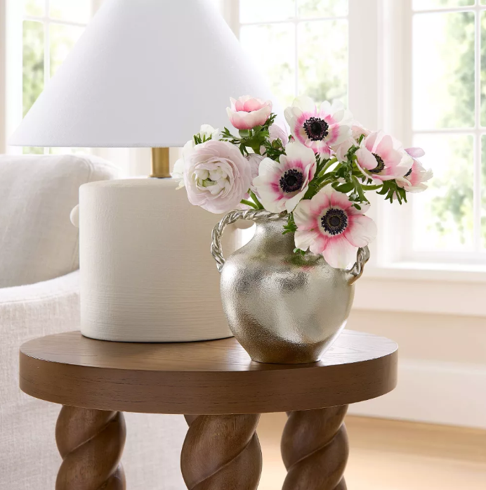
Shea McGee’s embrace of silver is telling. When a designer known for warm, rustic, layered interiors pivots to a cool-toned metal, you know the cultural temperature has changed.
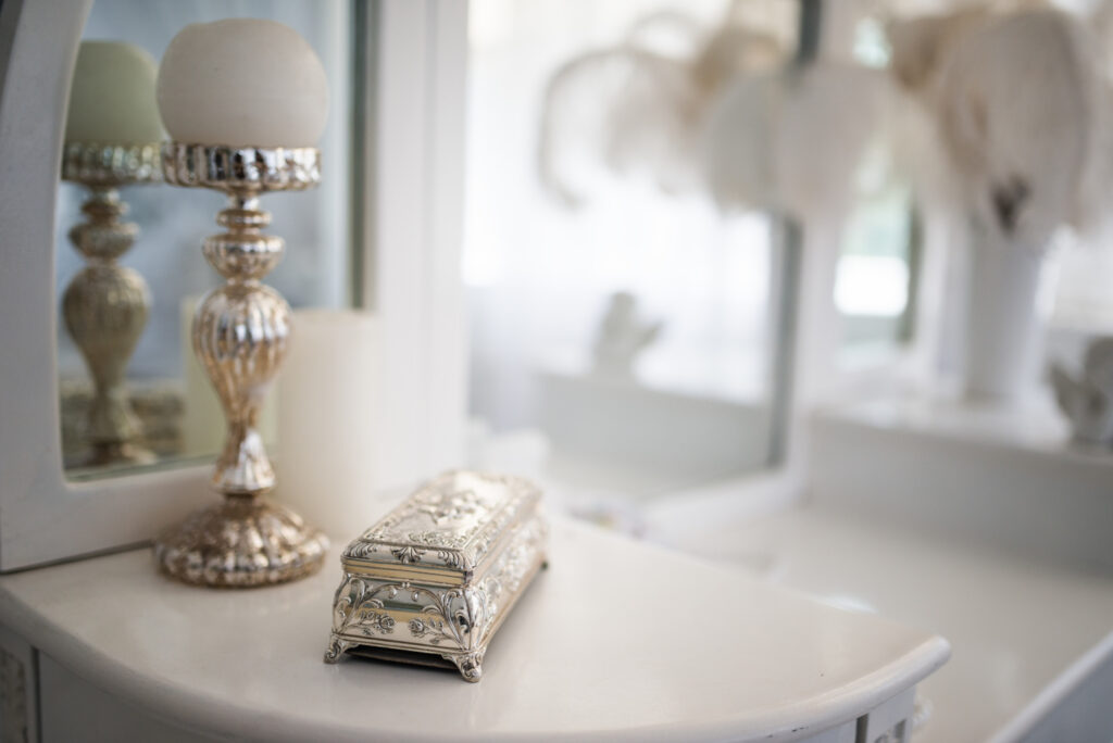
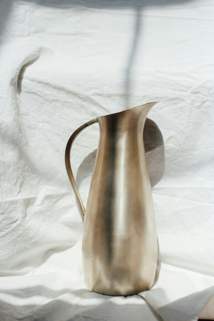
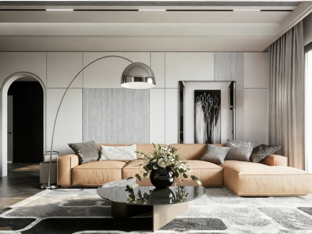
Silver reads heritage. It carries a memory of heirloom flatware, antique trays, traditional candlesticks. Compared to chrome, which feels sharp and architectural, silver and polished nickel offer some diffusion. The shine is gentler and the reflection is softer. Plus, the patina potential is real.
In layered interiors, that subtle reflectivity is a gift. It catches firelight, amplifies natural daylight, and plays well with variation. In a room full of walnut, linen, and hand-thrown ceramics, silver introduces contrast without tipping into sterility.
For transitional and classic projects, it’s an easy insertion. For contemporary work, it’s a way to add luminosity without defaulting to brass, which at this point can feel automatic. The larger context matters too. Clients are craving character and sensory depth, and silver delivers light and history at the same time.
Items We Love
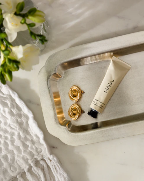
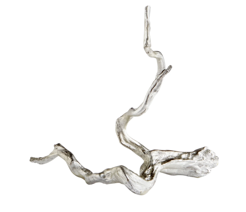
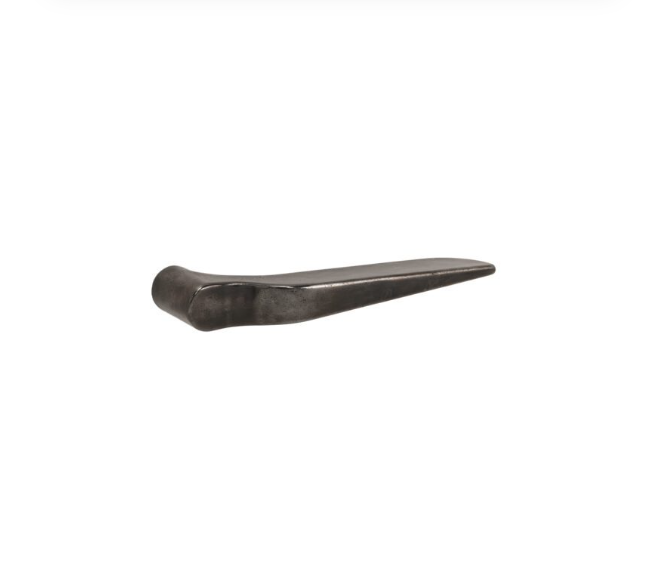
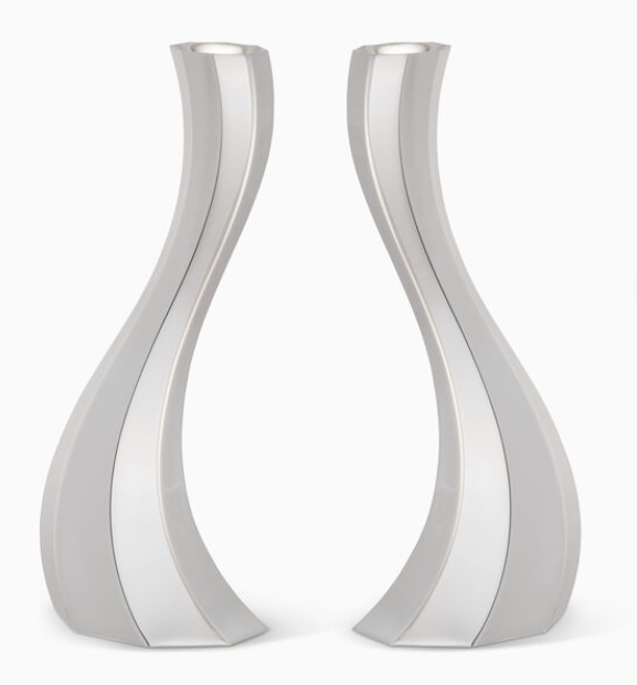
The Drip Effect
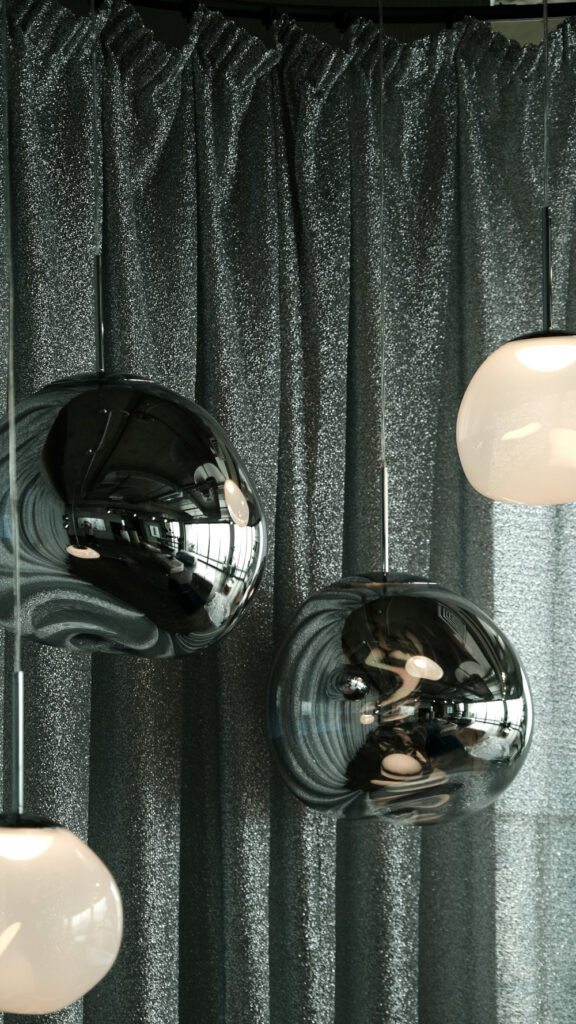
Specifically, ASID highlights “melted” metallic finishes as a defining detail for 2026, inviting liquidity where edges soften, forms ripple, and hardware looks as if it was cast mid-pour. This is part of a broader move toward immersive surfaces. Think iridescent sheens, blended metal-and-glass compositions, and reflective textures that shift as you move through a space.
Cabinet pulls with rounded, swollen corners. Candleholders that twist like liquid chrome. Lighting with droplet-like arms or pooled bases. Even knobs that feel slightly off-axis. These details function as micro art pieces that catch light unevenly, which adds dynamism to otherwise static millwork or furniture. You’re specifying jewelry for the room.
Items We Love
Studio McGee for Target
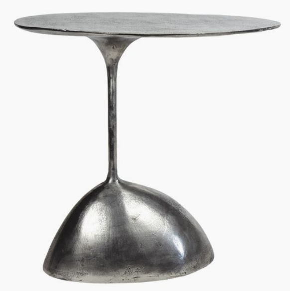
Rizzo Aluminum 24″ Oval Accent Table
One Kings Lane
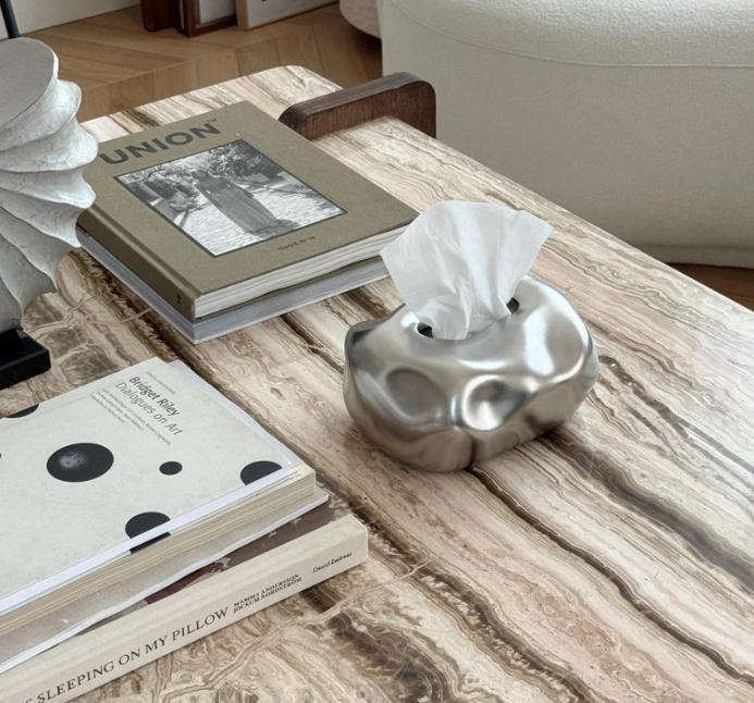
Bubble Ceramic Tissue Box Cover
Ceramic Aura
How to Use Silver
The fastest way to get this wrong is to isolate silver in a stark, high-contrast environment. That’s not where the new metallics live. Instead, embed them. Pair silver with:
- Mid-tone woods with visible grain
- Honed or lightly veined stone
- Plaster or limewash walls
- Warm whites and complex neutrals
- Textiles with depth: bouclé, brushed cotton, wool blends
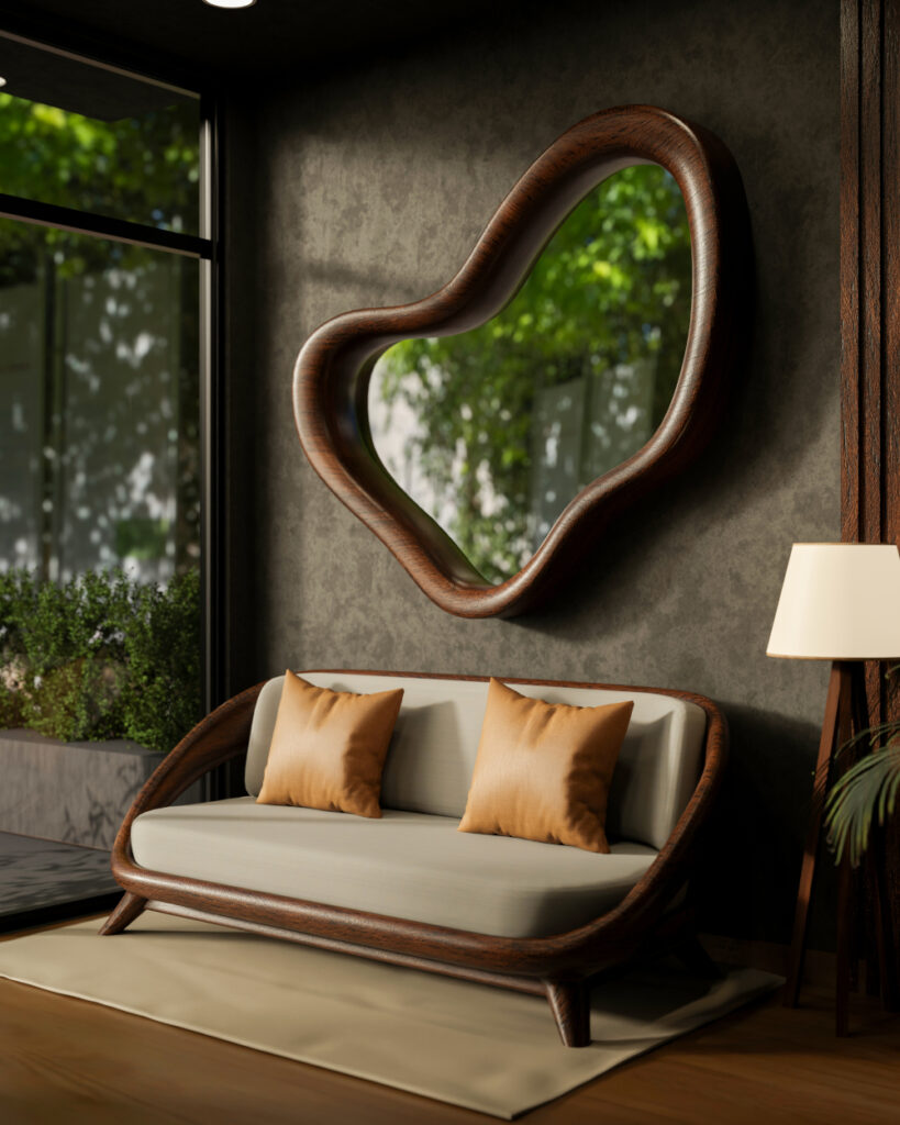
Silver thrives in contrast with matte surfaces. In kitchens, consider polished nickel or silver-toned hardware against painted cabinetry in muted greens, clay neutrals, or smoky blues. On walnut cabinetry, silver reads crisp and tailored. On creamy millwork, it feels fresh but not stark.
In living spaces, use silver in smaller, repeatable moments. A pair of taper holders on a reclaimed wood dining table. A silver tray layered over a textured ottoman. A sculptural bowl on a bookshelf surrounded by linen-bound books and ceramic vessels.
Repetition is critical. One silver object looks accidental. Three feel intentional.
Stop Matching, Start Composing
With silver reentering the conversation, metal mixing becomes less about contrast and more about temperature layering. Silver next to aged brass works when both have depth. Avoid pairing bright, high-polish chrome with heavily antiqued bronze unless you’re deliberately creating tension. Try this hierarchy:
- Primary metal: silver or polished nickel (60%)
- Secondary metal: muted brass or warm bronze (30%)
- Accent metal: blackened steel or iron (10%)
Keep undertones in mind. Cooler marbles, gray-veined stones, and blue-based paints support silver beautifully. If your palette leans heavily yellow or red, temper it with cooler textiles or artwork so the silver doesn’t feel out of place.
Where the Drip Actually Belongs
Fluid metallic forms are trending and seductive. That doesn’t mean they belong everywhere. Use “melting” details where clients will engage at eye level or hand level:
- Kitchen pulls and knobs
- Bathroom vanity hardware
- Console table bases
- Decorative lighting in powder rooms
- Dining table objects
Avoid overloading primary architectural elements. A full run of highly sculptural cabinet pulls in a large kitchen can tip into novelty. Instead, you could concentrate the drama on an island and keep perimeter cabinetry quieter. In bathrooms, a subtly curved silver faucet against a tactile stone backsplash hits the sweet spot. It’s current without feeling trendy.
For commercial designers, this is an opportunity in hospitality and boutique retail. Fluid metallic lighting or custom hardware becomes a brand signature. The light play alone is worth the investment.
Silver as a Light Strategy
Beyond aesthetics, silver is a lighting tool. In smaller rooms or north-facing spaces, silver can counteract flatness. In candlelit dining rooms, it multiplies glow. In bathrooms, it enhances clarity without the harshness of mirror-on-mirror reflections.
When layered with glass, as ASID notes, the effect becomes dreamy and dimensional. If you’re aiming for spatial nuance, this is where it happens. Clients may not have the vocabulary for it, but they feel it immediately.
What This Means for You
The return of silver and the rise of fluidity in metallic forms signal that precision is giving way to expressiveness. You have an opportunity to reintroduce cool metals in a way that feels grounded and mature.
Skip the nostalgia for ultra-modern chrome kitchens. Skip the safe overuse of brass. Instead, explore silver as contrast, as jewelry, as atmosphere.
Expect to see organic metallic forms across every category in the next year. Plan for it. And go with the flow by building it into moments where silver can curve, pool, or ripple rather than sit cold and flat.
SOURCES: Home & Gardens, ASID, Studio McGee, Lighting News Now