

This summer, design professionals are responding to a deeper cultural shift to ditch the screens and touch grass. Pinterest’s 2025 Summer Trend Report identifies the movement toward “Digital Detox Summer” as a signal that clients and consumers are seeking serenity, sensory engagement, and authentic connections with nature in their spaces. In response, earthy greens, led by dill green, are making a decisive comeback as deeply rooted expressions of calm, creativity, and comfort. Interior Design 411 shares our take on the trend and a few favorite paint picks to channel your inner green goddess.
Why Dill Green is the Shade of the Season
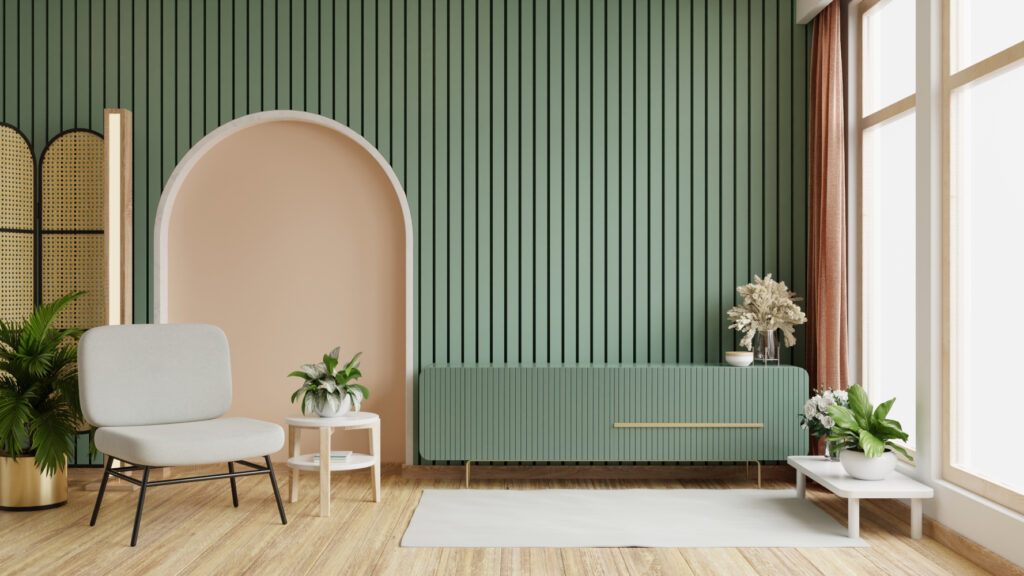
Dill green, described by Pinterest as “pickled perfection,” is having a serious moment. This soft, nostalgic green still nods to Y2K-era palettes while fitting seamlessly into today’s sustainable, biophilic interiors. The “Digital Detox Summer” trend signals a collective move toward slower living, and dill green captures that ethos perfectly in color form. It’s cropping up everywhere, from painted accent walls in light-filled apartments to moody nooks in glam remodels, showing an incredible range and adaptability.
Dill green brings a subtle complexity that feels tactile, grounded, and oddly refreshing. The hue sits somewhere between herbaceous, muted chartreuse and soft olive, working well across aesthetics — boho, dark academia, cottagecore, even mid-century modern — depending on how it’s styled. A few standout dill green shades to consider:
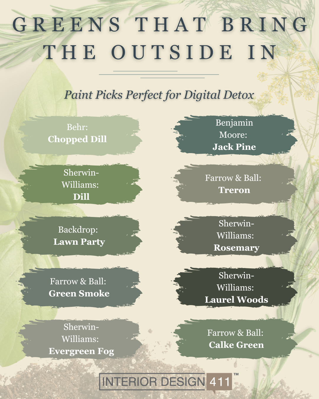
- Behr’s Chopped Dill — A sharp, vivid green with yellow undertones that works well in kitchens and sunrooms. Its brightness adds energy without overwhelm.
- Sherwin-Williams’ Dill — A soft, botanical green that leans into the herbal inspiration of its name. Ideal for tranquil nooks or garden-facing rooms where you want to subtly blur the line between indoors and out.
- Backdrop’s Lawn Party — Youthful and lighthearted. Use it in airy, minimal areas to give just a hint of drama.
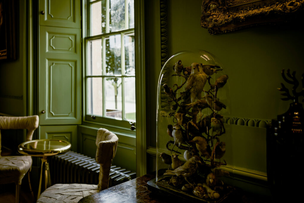
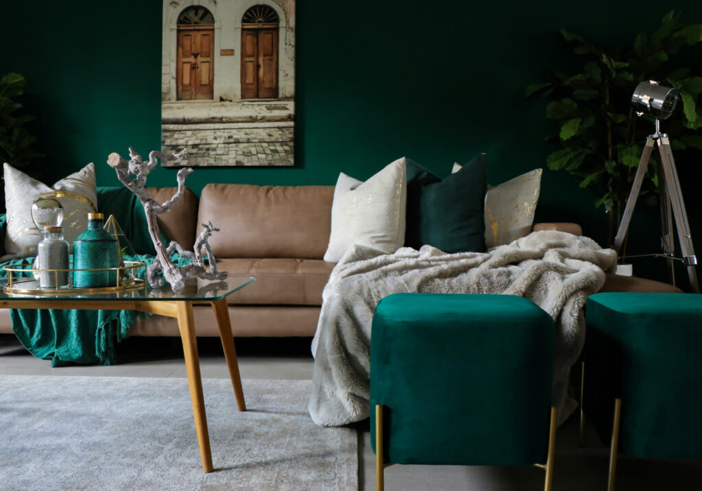
- Farrow & Ball’s Green Smoke — Deeper and moodier, it adds weight and historical depth, particularly effective in small rooms or when layered with darker blues or metallics.
Paint Picks Beyond Dill
Designers who want to explore green’s full range outside of dill have a wealth of richly nuanced tones to choose from. These designer favorites illustrate the complexity of green’s undertones and how it responds to space, light, and pairing:
- Sherwin-Williams’ Evergreen Fog — A chameleon-like sage that shifts between gray and blue depending on the light. Excellent for transitional spaces or anywhere you want a versatile, calming tone. See it seamlessly connect all the botanical wallpapers traversing this dark hallway makeover as the perfect leafy neutral.
- Benjamin Moore’s Jack Pine — A darker, blue-leaning green that feels sophisticated without being cold. Use it in mudrooms, entryways, or to define a small workspace.
- Farrow & Ball’s Treron — An olive-based green with yellow undertones, ideal for darker rooms where you want to emphasize an enveloping warmth.
- Sherwin-Williams’ Rosemary —Perfect for cabinetry and accent walls when you’re after a subtle but grounded statement. See it pair perfectly with white oak and blush pink florals in this serene kitchen remodel.
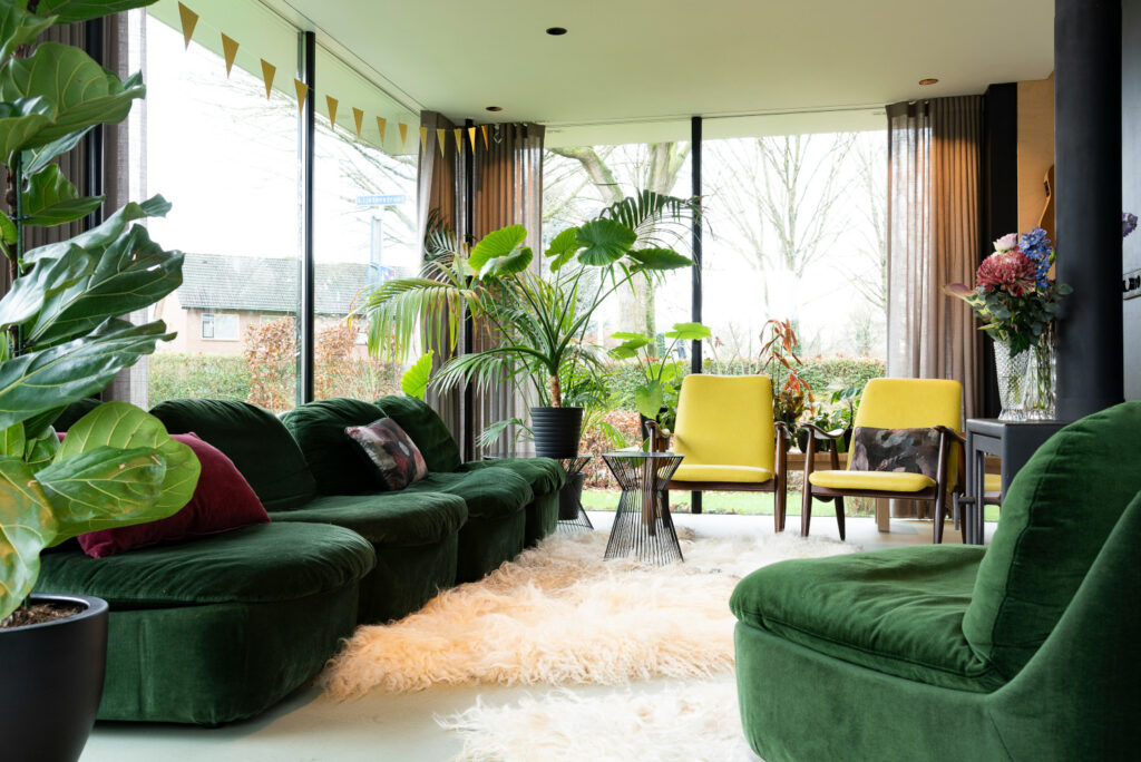
- Sherwin-Williams’ Laurel Woods — Rich and dark with gravitas, be prepared for this dark option to soak up light and add a decidedly moody flair. Great for blanketing rooms in coziness, especially paired with caramel leather and dark wood.
- Farrow & Ball’s Calke Green — A bold, historically rooted olive that’s anything but shy. Go bold with a color-drenched approach that reads as deeply organic, such as in moody libraries, dramatic dining rooms, or entryways.
From olive to mint to forest green, the ability of this lush palette to harmonize or contrast offers endless flexibility.
Sold on the Look? Here’s How To Style It
Styling green successfully starts with understanding its interaction with light and layers. Begin by assessing the room’s natural light. Greens are famously adaptable, shifting tone throughout the day. Always test swatches under both daylight and evening conditions. In cool, north-facing rooms, opt for greens with warm, yellow undertones (like Behr’s Chopped Dill) to avoid feeling flat or gray. Meanwhile, sun-soaked southern exposures can handle bolder, moodier shades without dulling their richness.
Finish matters, too. Matte and eggshell finishes enhance green’s organic feel and soften glare, ideal for restful zones like bedrooms or studies. In contrast, a satin or semi-gloss finish adds subtle vibrancy perfect for cabinetry, trim, or dining areas where you might want a bit of sheen and durability.
The Pinterest report’s nod to rustic farmhouse interiors and vintage, thrifted decor signals a return to tactility and imperfection. Dill green and its counterparts thrive in these settings. Layer them with textured woods, handmade ceramics, stone counters, terracotta tiles, natural linens, and reclaimed or vintage fabrics to deepen the sensory experience.
For added richness, mixing greens in the same room can mimic the diversity found in nature. Think soft olive paired with dark forest green, or muted sage against crisp white and aged brass. The result reads as both natural and intentional.
Greens can soften a space, sharpen its edges, or pull the outdoors in, all depending on context and application. Here are a few more ideas to consider, based on the room you’re styling:
- Kitchens: Dill green or olive cabinetry evokes freshness and grounding. Try pairing with terracotta backsplashes or vintage tile.
- Bedrooms: Use darker greens for immersive, cozy environments that calm the senses.
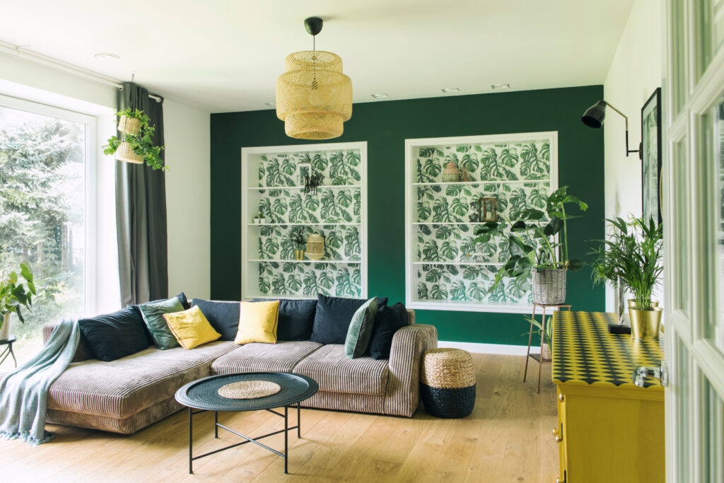
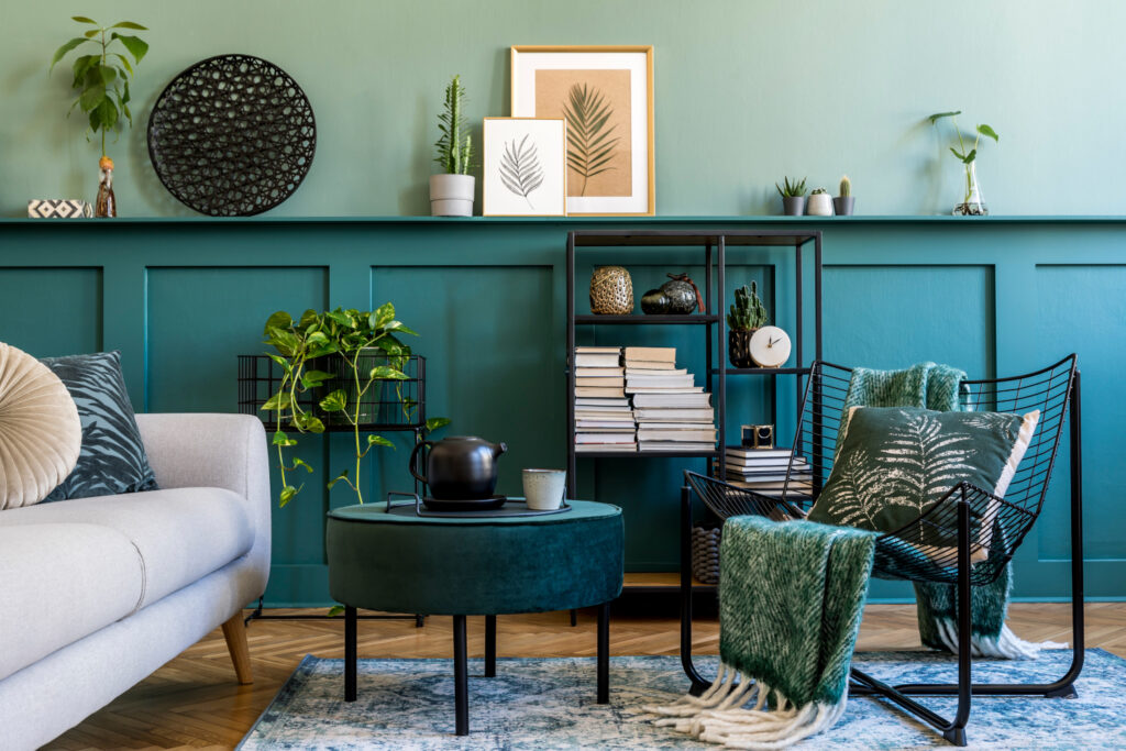
- Living Rooms: Incorporate thrifted decor, trinket shelves, and vintage lighting to create a relaxed, soulful aesthetic. Walls in deep or sage green colors provide a sophisticated backdrop to eclectic styling.
- Outdoor-to-Indoor Flow: Garden parties and book clubs are also trending per Pinterest’s report. Use green tones to bridge the indoors with the outdoors through leafy accents, painted garden furniture, or even just strategically chosen linens.
Whether you’re crafting a sun-drenched reading nook or reimagining a farmhouse kitchen, dill green and its earthy siblings offer a palette full of promise. This summer and beyond, use green to create spaces that invite presence, inspire reflection, and help clients log off and truly live in the beautiful homes you design for them.