Melissa Diehl

Melissa Diehl
63 POSTS 0 COMMENTS

Bye Bye Beige: Embracing Bold Accents in 2024

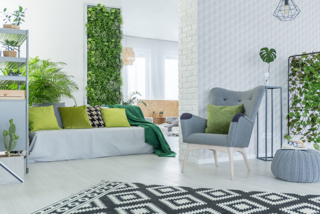
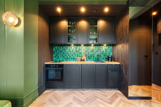
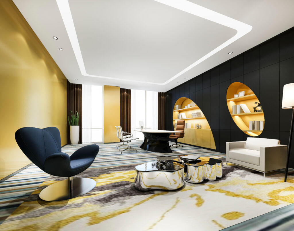
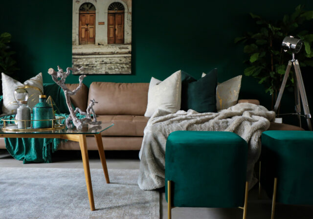
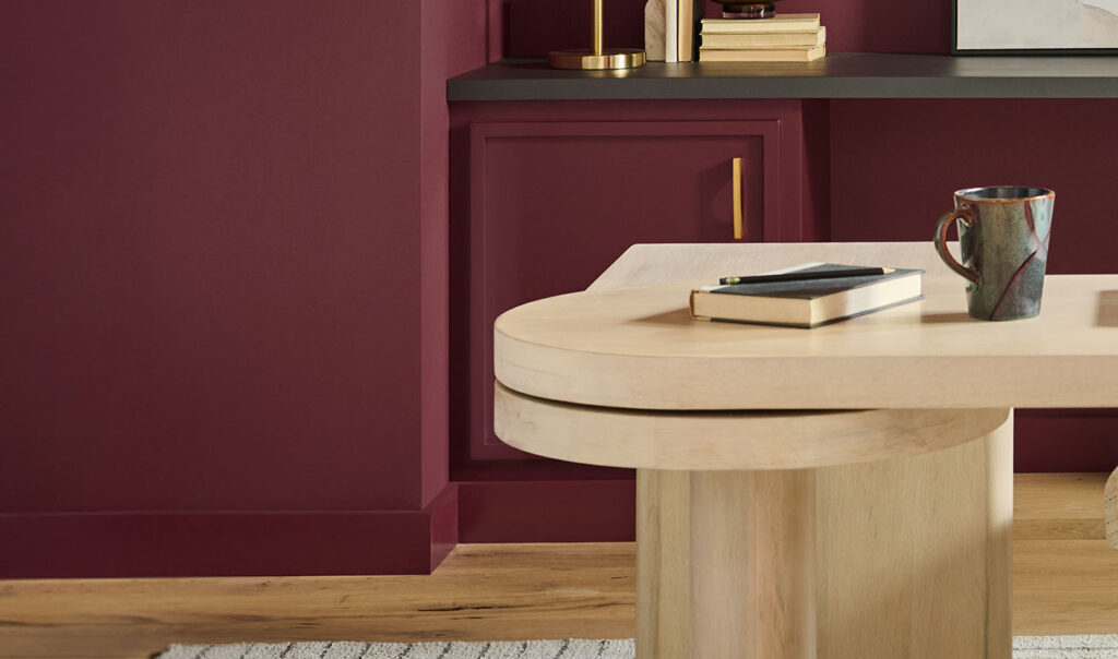
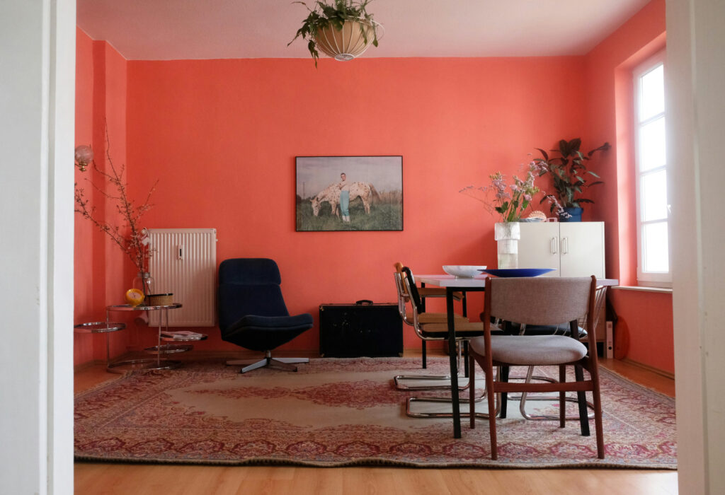
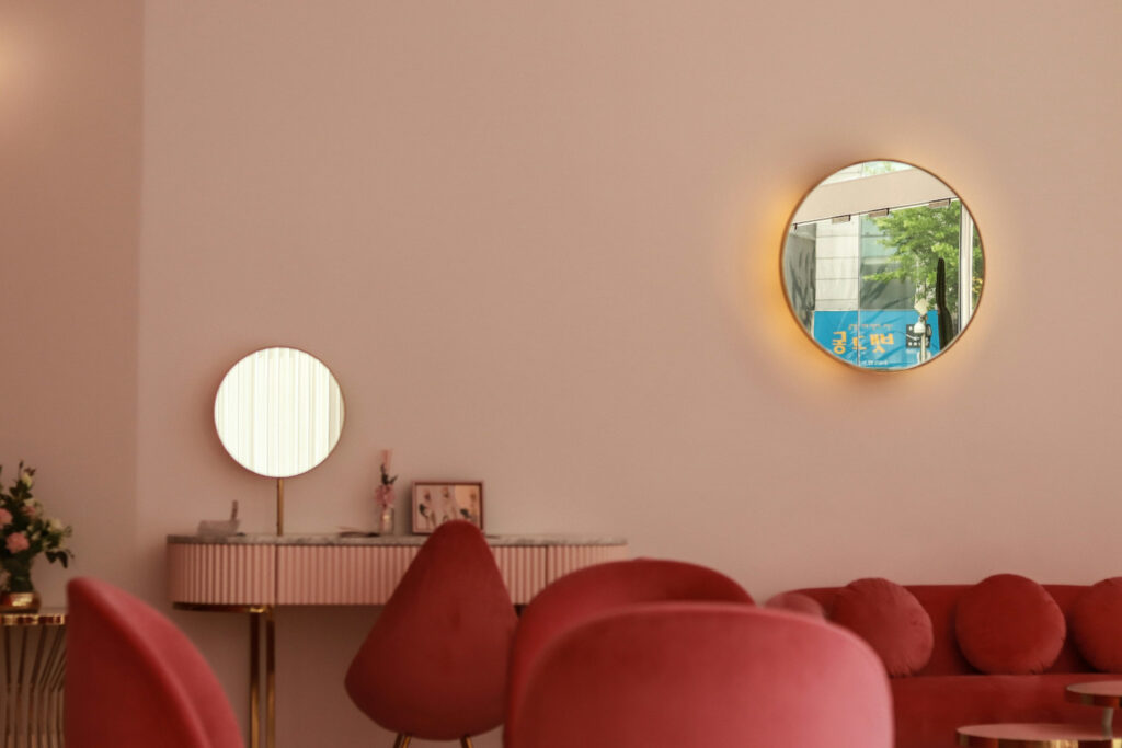
For years, minimalism reigned supreme, with clean lines and neutral palettes dominating the design landscape. But as we move through 2024, a refreshing shift is emerging: the strategic use of bold accents and maximalist themes. This trend injects personality and vibrancy into spaces without sacrificing functionality.

So how can you incorporate this trend into your projects? Here are two key strategies:

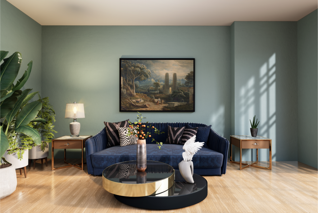
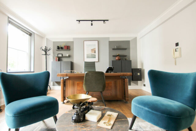
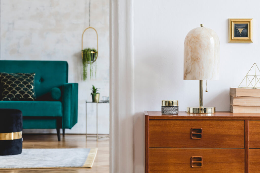
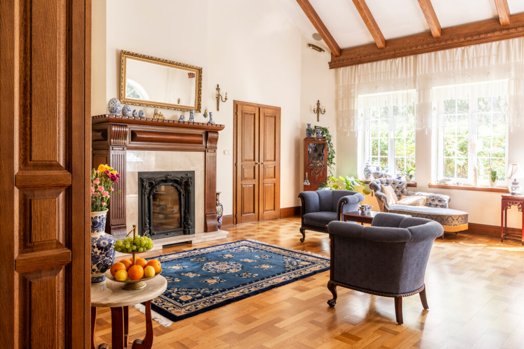
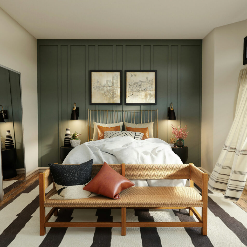
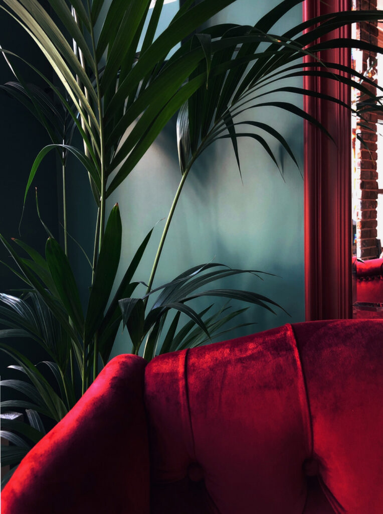
Statement Furniture: A single, well-chosen piece in a saturated hue or with a unique pattern can become the focal point of a room. Think a burnt orange armchair in a minimalist living room, or a jewel-toned velvet sofa anchoring a neutral space.
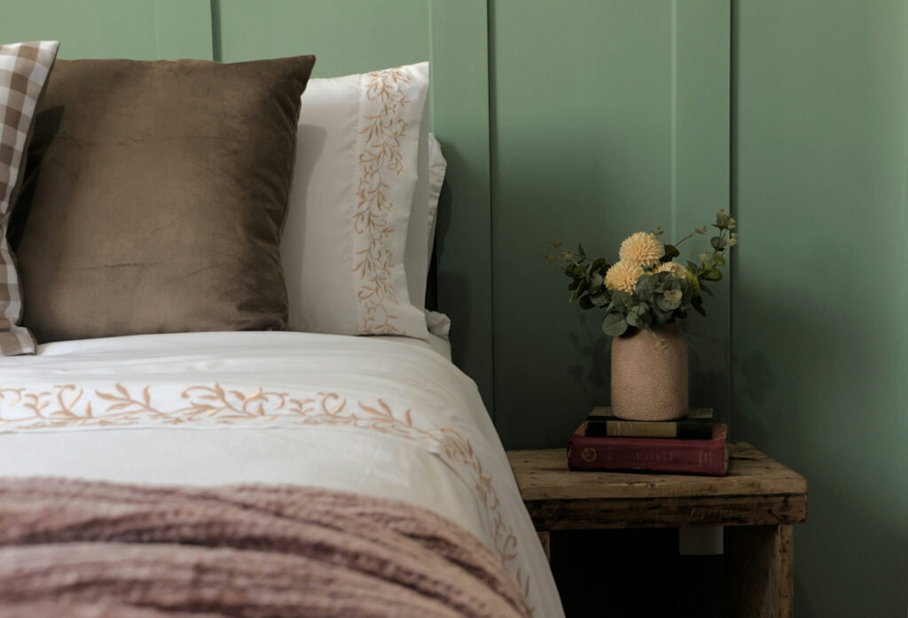
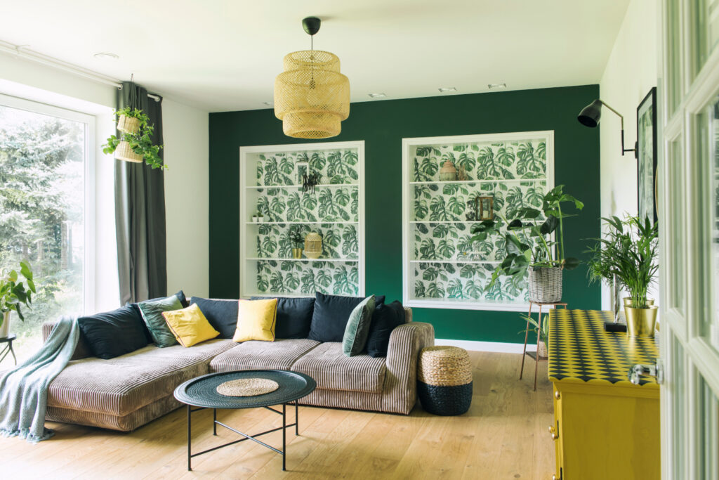
Playful Patterns: Don’t shy away from patterned wallpaper or textiles.  Opt for geometric prints in unexpected color combinations, or large-scale florals for a touch of whimsy. The key is to balance bold patterns with neutral elements to maintain a cohesive look.

Remember, the beauty of this trend lies in its versatility. It caters to a range of aesthetics, from the playful maximalist to the discerning minimalist seeking a touch of personality. By embracing bold accents, you can create truly unique and memorable spaces for your clients, setting yourself apart in the ever-evolving world of design.

Designing Success: Proven Marketing Moves for Interior Designers

Standing out as an interior designer in today’s world requires a strong brand identity. But with so much competition, how can you effectively reach your target audience and showcase your unique style? Here are some actionable marketing strategies to stand out as an interior designer:
  1. Niche Down and Claim Your Expertise:

Gone are the days of being a jack-of-all-trades. Identify a design niche – eco-friendly homes, minimalist living spaces or even a specific clientele like busy professionals. This allows you to tailor your content and messaging to resonate with a specific audience, increasing your perceived authority in that niche.

  1. Embrace Video Marketing:

People crave visual inspiration. Utilize platforms like Instagram Reels and YouTube to showcase your design process, before-and-after transformations, or quick design tips. Partner with local influencers for home tours or product reviews to tap into a wider audience.

  1. Leverage the Power of Storytelling:

Don’t just present beautiful spaces – tell their stories. Share client testimonials, behind-the-scenes glimpses, and the inspiration behind your designs. This emotional connection allows potential clients to envision your expertise transforming their own lives.

  1. Offer Valuable Content (For Free):

Establish yourself as a thought leader by providing informative blog posts, downloadable design guides, or hosting webinars on relevant topics. This positions you as a resource, fosters trust, and increases website traffic – all while subtly promoting your services.

  1. Get Strategic with Social Media:

Focus on quality over quantity. Post consistently but curate a visually cohesive feed that reflects your brand aesthetic. Utilize Instagram Stories for live Q&A sessions or sneak peeks at ongoing projects.

Bonus Tip: Rethink Networking:

While traditional networking events hold value, explore online communities dedicated to interior design. Engage in discussions, offer design advice, and build relationships with potential clients, collaborators, and vendors.

Remember, marketing is an ongoing journey. By consistently implementing these strategies and refining your approach, you’ll build a strong brand that attracts your ideal clients and propels your interior design business to new heights.

Cracking the Code on Client Communication: A Guide for Interior Designers

Effective communication is the cornerstone of a successful interior design. Clients come with a range of concerns, from merging design styles to maximizing a small space or staying on budget. Here are some quick tips to navigate these common roadblocks and foster a smooth design journey:

Style Fusion Confusion? Mood boards are your secret weapon! Let clients explore a variety of aesthetics through curated collages. Highlight unifying elements like color palettes or material textures to create a cohesive look and help build the vision.

Space Limited? Spatial awareness is key. Use furniture placement icons on floor plans to demonstrate efficient layouts and maximize natural light and other visual tricks for an airy feel.

Budget Woes? Transparency is key. Partner with clients to prioritize their needs and wants. Showcase sample palettes and suggest budget-friendly alternatives like multifunctional furniture or repurposed finds.

Can’t See the Vision? If your client is having trouble seeing the vision, show them! Bridge the vision gap with technology. Utilize 3D renderings and virtual walkthroughs to give clients an immersive experience of their future space.

Incorporating Existing Pieces? Most clients come with existing furniture pieces and decor you will need to incorporate into your design. Reassurance is golden. Let clients know their cherished pieces can be seamlessly integrated. Explore reupholstery options or suggest layouts that complement existing elements.

By implementing these communication hacks, you can decode client concerns, build trust and ensure a design experience that exceeds expectations.

Elevate Your Designs at High Point Market April 13-17

High Point Market Spring, which features more than 2,000 exhibitors showcasing over 22 categories of the latest furniture, textiles, decor, and design and 75,000 attendees in each market, will be held in High Point, NC on Apr. 13-17, 2024. Network with industry icons  and source cutting-edge products at this pinnacle design event. Connect with influential editors, top designers and leading brands. Discover upcoming trends, source unique pieces and gain insights to elevate your design practice. It’s the perfect platform to network and stay ahead of the curve and go beyond the showrooms with a week of inspiration that offers more than just exhibits. Enjoy a packed schedule of events, speaker sessions, and entertainment. The official app and concierge services ensure a seamless experience. Don’t miss this opportunity to learn, connect and be inspired! Register at the website here.

Mastering the Mix of Textures and Patterns

Textures and patterns are the unsung heroes of interior design. They add depth, personality and both visual and tactile interest to a space, transforming a sterile or bland environment into a vibrant and inviting one. But for interior designers, navigating the world of textures and patterns and achieving a cohesive look can be a challenge. Here are some practical tips to confidently mix and match these design elements to create a space that sings.

Understanding Textures and Patterns

First, let’s establish the difference between texture and pattern. Texture refers to the tactility or surface quality of a material – think the smoothness of velvet or the roughness of brick. Pattern, on the other hand, is a visual design created by the repetition of elements, like stripes, florals, toile or geometric shapes.

The Power of the Mix

While both textures and patterns can stand alone, their true magic lies in their ability to be combined. Here’s how this collaboration elevates your design:

  • Adds Depth and Dimension: Flat spaces come alive when layered with textures and patterns. Juxtaposing a smooth leather sofa with a fluffy rug creates a dynamic interplay of surfaces, making the room feel more interesting.
  • Creates Focal Points: Patterns can be powerful tools for drawing the eye to specific areas. A patterned accent wall or a boldly textured throw pillow can become the focal point of a room, guiding the visual journey.
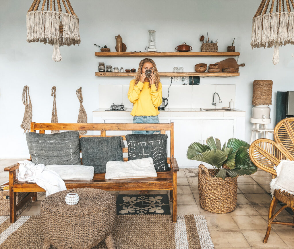
  • Expresses Style and Personality: Textures and patterns are a fantastic way to infuse a space with a particular style. Think woven baskets and natural fibers for a bohemian vibe, or sleek marble and geometric patterns for a modern look.

A Practical Guide to Mixing and Matching

Here are some key principles to remember when mixing and matching:

  • Start with a Neutral Base: A neutral backdrop provides a foundation for layering bolder textures and patterns. This prevents the space from feeling visually overwhelming.
  • Balance is Key: Aim for a harmonious interplay between contrasting textures and patterns. Rough textures can be balanced with smoother ones, while large-scale patterns can be paired with smaller, more intricate ones.
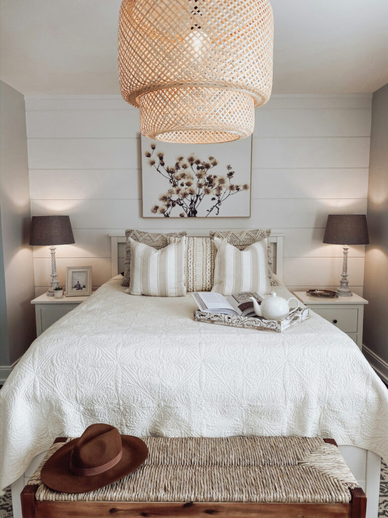
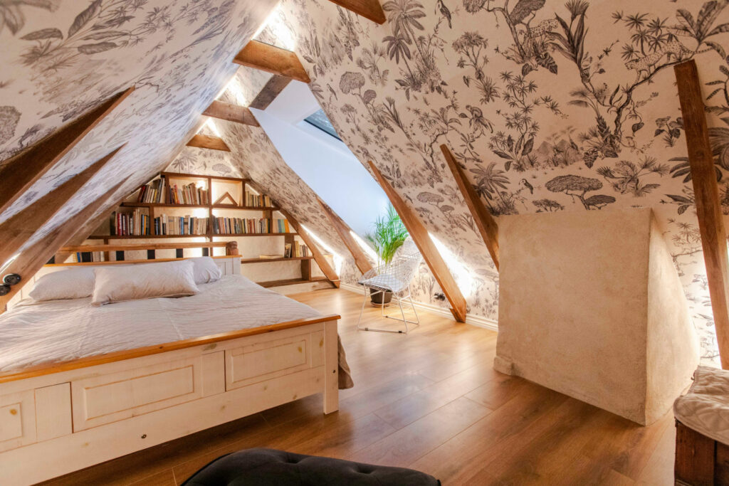
  • Consider Scale and Proportion: The size and scale of patterns matter. Large patterns can make a small room feel even smaller, while small patterns might get lost in a spacious area. Play with scale to create a sense of equilibrium. The key to mixing patterns in a maximalist space, for instance, is varying the scale of the patterns you are mixing.
  • Unity Through Color: Even when mixing diverse textures and patterns, strive for a sense of cohesion through color. Choose a color palette and ensure both textures and patterns incorporate elements from that palette.
  • Don’t Be Afraid to Experiment: Don’t be afraid to experiment with different combinations. Trust your eye and create a mood board or mock-up to visualize the final outcome before committing.

Beyond the Basics

Here are some additional tips to take your mastery to the next level:

  • Think in Threes: When incorporating multiple patterns, aim for a rule of threes. This creates a sense of order and prevents visual clutter.
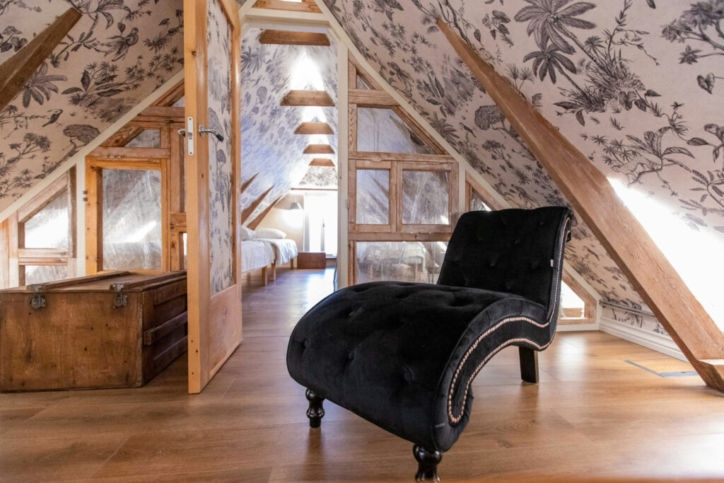
  • Play with Materials: Don’t limit yourself to traditional textiles. Experiment with textured wallpapers, metallic accents and natural materials like wood and stone to add variety.
  • Lighting is Key: The way light interacts with textures and patterns can dramatically alter their impact. Experiment with different lighting sources to create dramatic effects or a softer ambiance.

Textures and patterns are powerful design tools that can elevate your interiors and add layers of visual interest. By understanding their potential and following the principles outlined above, you can confidently mix and match these elements, creating spaces that are not only beautiful but also reflect your unique design vision. Remember, there are no hard and fast rules – the key is to experiment, trust your eye, and have fun with the process! So, unleash your creativity, embrace the power of textures and patterns, and watch your design dreams come to life.

Designing for Clutter: Space-Savvy Storage Secrets for Clutter-Free Living

In modern living spaces, clutter is a pervasive challenge, necessitating interior designers to engineer innovative solutions that can meld functionality and aesthetics. Get crafty with storage solutions and designs that not only alleviate clutter but also enhance the living environment, making every square inch of space count.

Understanding the Client’s Needs

A deep understanding of client needs is paramount to designing spaces that are both decluttered and designed to maximize space. It is essential to assess the client’s lifestyle, how they utilize their space and their specific storage needs to tailor personalized and functional solutions. This process may require thoughtful questioning and keen observation to uncover the client’s daily routines, habits and preferences. Recognizing their most significant storage challenges and priorities is crucial to providing value to clients. Whether it’s accommodating a growing “bookshelf wealthy” collection of books, optimizing a small living area or designing a multi-functional space for a home office, each solution should be customized and reflect the unique way the client inhabits their space. By prioritizing this understanding, designers can craft spaces that improve client satisfaction and outcomes for daily life.

Innovative Storage Trends

The latest trends in storage are gravitating towards modular units, multifunctional furniture, and ingeniously hidden compartments. These options are not just space savers but also style enhancers, seamlessly blending with the overall design while providing utility. Modular units offer the flexibility to adapt to changing needs and spaces, allowing for customization and reconfiguration. Multifunctional furniture pieces, such as beds with built-in storage, charging stations or even a desk or extendable dining tables, maximize utility in minimal spaces and embody the essence of modern living. Hidden compartments, like secret drawers, pop-up cabinets or even hidden wall storage utilize otherwise overlooked spaces, offering clever storage solutions without compromising the aesthetic appeal of the space.

Space Maximization Techniques

Successfully maximizing available space is a cornerstone in interior design. These same principles should guide achieving clutter-free living environments. Effective strategies include ensuring the utilization of the full potential of the vertical real estate, drawing the eye upward and making use of the full height of a room. Lean into trendy maximalist style with pieces that stretch the vertical real estate and give depth to the space such as tall bookshelves filled with colorful books, tchotchkes and personal treasures. These lofty design decisions transform storage into personalized décor and a captivating visual anchor that can amplify the perceived space, drawing the eye upward and accentuating the room’s verticality. The vertical space can be used in more discreet ways as well, such as an under-the-floor toybox solution where the designer essentially used an elevated floor space to tuck away unsightly toy clutter.

Utilizing under-utilized areas, such as under stairs, over doors, in awkward corners, with bespoke solutions can turn these overlooked spaces into functional storage havens that nest discreetly into everyday living. Custom-built units are tailored to fit the exact dimensions and style of the space. Consider a custom modular storage system that can shift the room on a carefully-designed rail system that utilizes the custom dimensions of the space in a transformative way. By cleverly incorporating these techniques and considerations, designers can craft spaces that are not only efficient and organized but also visually expansive.

Integrating Technology in Storage Solutions

The integration of smart technology in storage solutions marks a significant advancement in optimizing space and promoting decluttered living with interior design. Automated drawers, app-controlled organizational systems and cutting-edge security features are redefining convenience and efficiency in modern homes. These smart innovations not only streamline storage management but also enhance the user experience by ensuring easy access, optimal organization and secure storage.

Embrace the future by integrating innovative storage solutions that marry style with functionality, creating clutter-free and serene living spaces that promote wellness. Challenge yourself to reimagine every inch of space with creativity and smart technology, transforming ordinary areas into extraordinary, highly efficient havens.

SOURCES: HouzzDécorMatters

The Art of Illumination: 4 Pro Tips to Enhance Your Lighting Game

Function First

Consider how the space will be used, and always choose function over aesthetics to ensure your lighting provides sufficient visibility for the tasks at hand. Make an approved plan before buildout begins.

Layer the Look

Take a layered approach with multiple sources of light across different levels to create the perfect ambiance with depth and personality. Use unobtrusive and discreet lighting designs like can lighting as a foundation to layering and consider every square foot as opportunity for illumination from sconces to stair lighting.

Curate Cohesion with Light

Ensuring consistency within all aspects of design is important to creating a cohesion within the space. Different color temperatures, styles or plans can vary but can make the design feel uneasy if overdone.

Know the Vertical Real Estate

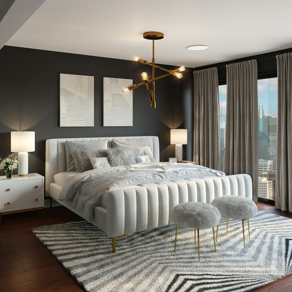
Consider things like ceiling height and furniture when hanging fixtures. As a rule of thumb, the bottom of a light should hang about 12-20 in. below a standard ceiling. For each additional foot of ceiling, add 3 inches.

SOURCES: HouzzHampshire Light