Melissa Diehl

Melissa Diehl
117 POSTS 0 COMMENTS

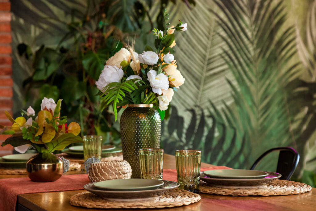
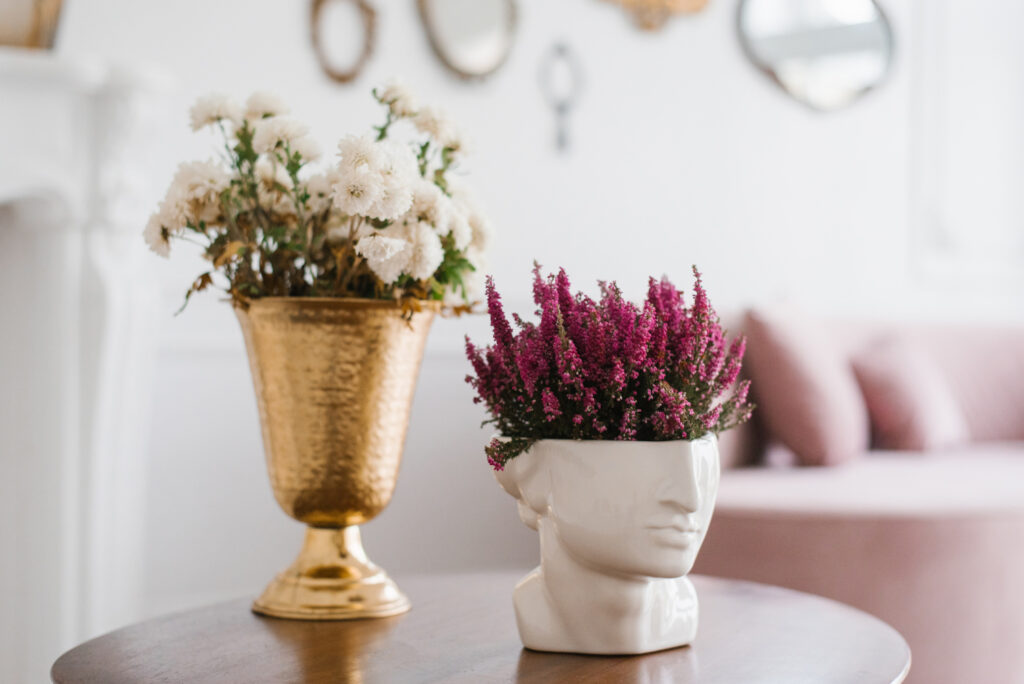
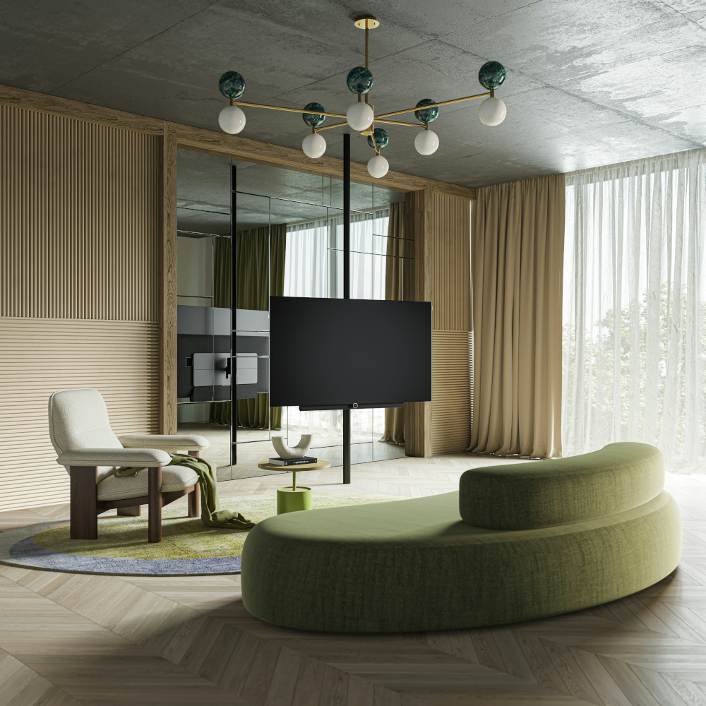
Your July Hit List: Design Events To Inspire, Source, and Scale

Summer is heating up with an exciting lineup of events for design pros. It’s the perfect time to recharge your creativity while sourcing fresh perspectives (not to mention hidden gems!), upskilling in an era of uncertainty, and networking with those shaping the future of interior design. Interior Design 411 shares what’s worth your time in July 2025. 

Online Workshop: Create Scroll-Stopping Content That Converts | July 9 1:00 – 3:00 p.m. EST | Virtual 

In the second part of her Social Storytelling series, strategist Ericka Saurit offers an advanced, practical dive into using Instagram intentionally as a driver of interest, traffic, and conversion for your design business. This session moves beyond aesthetic curation to unpack how your feed, stories, and overall content funnel work together to build a cohesive, brand-forward visual presence that attracts the high-end clients you crave. 

Dignify by Design Summit | July 9–10 | Santa Fe, NM 

At the Museum of International Folk Art, this summit gathers leaders in design, architecture, and media to discuss how dignity informs creative processes. Expect more than your typical trend talk here. Panels will address sustainability, design’s role in cultural dignity, and the ethics of material sourcing. With Kravet’s Scott Kravet and Wolf-Gordon’s Marybeth Shaw in attendance, the event will be dense with industry insights for designers seeking to align business strategy with responsible design practices. 

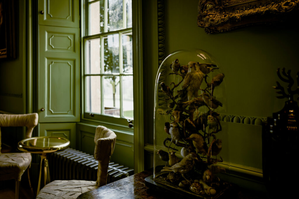
East Hampton Antiques & Design Show | July 11–13 | East Hampton, NY  

Set on the historic Mulford Farm, this show is a well-edited hunting ground for antiques and mid-century decorative pieces for home and garden from about 50 dealers. It’s an excellent opportunity to source some truly unique pieces and support the East Hampton Historical Society.  

Webinar: No More Guesswork – Confident Pricing for Interior Designers | July 14 12:00 p.m. EST | Virtual 

This targeted webinar helps designers stop undercharging and start pricing with clarity. Led by business coach Nancy Quinn and designer Lesley Myrick, the session covers aligning fees with value, building profitable service packages, and avoiding pricing pitfalls that erode your bottom line.  

Nantucket by Design | July 14–17 | Nantucket, MA  

This annual festival celebrates Nantucket’s design heritage through panels, keynotes, and high-level discussions. Programming highlights include Martha Stewart with Fernando Wong, plus a design-fashion crossover panel with J.J. Martin and the founders of Veronica Beard. Beyond inspiration, these discussions can sharpen your ability to integrate fashion’s agility with interiors, particularly for clients with lifestyle-driven design expectations. 

Webinar: From Chaos to Control: How Automation Propels Your Business Forward | July 15 1:00 – 2:00 p.m. EST | Virtual 

Ready to streamline your marketing and attract your ideal clients? This session covers how to use automation, such as nurture campaigns, templates, and calendars, to move from chaos to control in your design business. Learn practical steps to eliminate manual tasks, align with emerging AI trends, and create a system that makes it easy for clients to start working with you while freeing your time for design work that moves the business forward. 

Flooring Sustainability Summit | July 15-17 | Washington, D.C. 

ASID’s Flooring Sustainability Summit is your chance to stay ahead of rising demands for eco-conscious materials and stricter sustainability standards. Designers, architects, and industry leaders will gather to share practical strategies for advancing green building practices throughout the supply chain. Featuring keynote Elizabeth Von Lehe, Chair-Elect of ASID, this event positions you to shape a more sustainable future while aligning your projects with the evolving environmental priorities clients now expect. 

Atlanta Market | July 15–21 | Atlanta, GA  

AmericasMart’s biannual market features thousands of brands across home decor, seasonal items, fashion accessories, and outdoor categories. It’s a comprehensive sourcing event with numerous opportunities for networking and brand discovery. 

Summer Casual Market Atlanta | July 15–17 | Atlanta, GA  

Co-located with Atlanta Market and featuring 200+ outdoor furniture brands under one roof, you can efficiently compare emerging materials, scale, and finishes for outdoor projects at this event. Look out for discussions on weather-resilient textiles and luxury outdoor living trends that continue to drive client interest post-pandemic. 

Why Interior Designers Should Know Relevant Codes & Standards | July 16 | Chicago, IL 

This ASID Design Learning Series session helps interior designers build confidence in applying critical codes and standards across residential, commercial, hospitality, educational, and healthcare projects. Led by Tracey Fillmore and Virginia Weida, the workshop will cover practical strategies for sourcing and implementing codes effectively, reinforcing your role in protecting the health, safety, and welfare of building occupants.  

Hampton Designer Showhouse | July 19–August 31 | Southampton, NY  

This annual showhouse is an excellent venue to steal style secrets and study the design choices of top firms like Purple Cherry Architects and Robert Brown Interior Design in context, translating high-end concepts to your own luxury residential projects. 

Home Textiles Sourcing | July 23–25 | New York, NY  

An essential visit if textiles are your specialty, this show covers fabric innovation, trade updates, and trend forecasting that directly inform your sourcing and specification processes. This year’s lineup will include a talk on tariffs and trade wars, making it a must-attend for keeping current, discovering the latest designs, and connecting with global suppliers. 

Las Vegas Summer Market | July 23–31 | Las Vegas, NV  

This large-scale event offers exposure to West Coast lifestyle trends, client-friendly furniture lines, and high-turnover decor brands. Attendees can explore hundreds of exhibits and join in industry events like a panel on staying ahead of industry trends featuring designers Christopher Todd, Anne-Marie Barton, and Peti Lau. 

The Newport Show | July 26–27 | Newport, RI  

Combining antiques, art, and contemporary design, The Newport Show offers a curated atmosphere where you can explore luxury coastal aesthetics, valuable for designers managing secondary home projects in beach markets or clients seeking relaxed elegance. 

Aspen Art Fair | July 29-August 2 | Aspen, CO 

Aspen Art Fair merges art, design, and hospitality in a boutique fair format during Aspen Art Week. With 40+ influential international exhibitors and artist-in-residence projects, the fair blends top-tier works by established and emerging artists with home tours, expert-led talks, and curated local experiences. 

Whether you’re hunting for the perfect textile, refining your pricing strategy, or looking to spark new design ideas, this month’s events will move your design business forward. Pick a few that align with your goals, and return to your projects with fresh insights and sharper perspective. 

Why Designers Can’t Ignore Sensory Design

If you’re still treating sensory design as an afterthought or a niche concern, it might be time to reconsider. Designing from a sensory lens builds inclusive, adaptable, and emotionally resonant spaces. This week, Interior Design 411 takes a closer look at how to design inclusive environments with sensory design principles in mind. 

Design for Multisensory Engagement  

Too often, design prioritizes visual impact alone. But our experience of space is multi-dimensional. Sensory design activates other critical inputs: acoustics, temperature, scent, touch, and even proprioception, the sense of where the body is in space. This broader engagement allows designers to shape environments that better support focus, relaxation, stimulation, or recovery, depending on the user and the use case. 

For interior designers working in healthcare, education, workplaces, or public spaces, this refocus has become a non-negotiable. Neurodivergent individuals, for example, often process sensory information differently. When a space bombards them with harsh lighting, echoing acoustics, or confusing layouts, it becomes exclusionary. Adjusting those inputs at the design level makes inclusion actionable. 

Offer Choice-Driven Layouts 

Good sensory design offers choice. It’s not about eliminating stimulation but about giving users the autonomy to select the environment that suits them. That might mean creating varied zones such as high-stimulation collaborative areas, neutral transition spaces, and low-stimulation quiet zones. 

Smart transitions are critical. If a calming area sits next to a noisy zone without proper acoustic or visual separation, it fails. Materials matter too. Acoustic treatments can be celebrated as part of the aesthetic language, especially as digital printing technologies now allow for tactile surfaces that look like wood, stone, or textiles while improving sound quality. 

Use a Data-Guided Approach 

Integrating sensory strategies starts with real user data. Tools like sound walks or behavioral mapping give insight into how people actually experience a space. This user-centric approach should happen early and often. Top-down assumptions don’t capture real needs, especially in institutions like hospitals or schools. 

Inclusive design also means talking to the people who will live and work in the space. That includes staff, children, patients, or neurodivergent users, not just leadership or stakeholders. Insights from these conversations can dramatically reshape priorities.  

Keep Adaptability in Mind 

People’s needs evolve. Spaces should too. Modular furniture, movable partitions, and dynamic lighting systems give users control over their environments. What works today may need to change tomorrow, especially in offices or educational settings where user makeup fluctuates. 

Build that adaptability into the original design brief. Sensory design isn’t a static deliverable but a framework for creating spaces that learn and evolve with their users. 

The New Standard 

If interior design is about improving quality of life, sensory design is central. It challenges designers to think more deeply about how people feel, move, and exist in space. It requires blending aesthetics with empathy and translating neuroscience and behavioral psychology into materials, layouts, and finishes. If you’re feeling intimidated, don’t be. Just start asking more questions! 

Sensory design allows spaces to speak to more people, in more ways, with more intention. As client expectations evolve, and the demand for inclusivity grows louder, interior designers must develop fluency in the language of sensory experience. So, start small, test ideas, talk to users, and design with adaptability in mind. That’s just good design. 

SOURCES: ICFF  

The ‘Digital Detox Summer’ and Why This One Earthy Hue Is Dominating Summer 2025

Couple, people and house wall or painting, roller and home renovation or together in new apartment

This summer, design professionals are responding to a deeper cultural shift to ditch the screens and touch grass. Pinterest’s 2025 Summer Trend Report identifies the movement toward “Digital Detox Summer” as a signal that clients and consumers are seeking serenity, sensory engagement, and authentic connections with nature in their spaces. In response, earthy greens, led by dill green, are making a decisive comeback as deeply rooted expressions of calm, creativity, and comfort. Interior Design 411 shares our take on the trend and a few favorite paint picks to channel your inner green goddess. 

Why Dill Green is the Shade of the Season 

Dill green, described by Pinterest as “pickled perfection,” is having a serious moment. This soft, nostalgic green still nods to Y2K-era palettes while fitting seamlessly into today’s sustainable, biophilic interiors. The “Digital Detox Summer” trend signals a collective move toward slower living, and dill green captures that ethos perfectly in color form. It’s cropping up everywhere, from painted accent walls in light-filled apartments to moody nooks in glam remodels, showing an incredible range and adaptability. 

Dill green brings a subtle complexity that feels tactile, grounded, and oddly refreshing. The hue sits somewhere between herbaceous, muted chartreuse and soft olive, working well across aesthetics — boho, dark academia, cottagecore, even mid-century modern — depending on how it’s styled. A few standout dill green shades to consider: 

  • Behr’s Chopped Dill — A sharp, vivid green with yellow undertones that works well in kitchens and sunrooms. Its brightness adds energy without overwhelm. 
  • Sherwin-Williams’ Dill — A soft, botanical green that leans into the herbal inspiration of its name. Ideal for tranquil nooks or garden-facing rooms where you want to subtly blur the line between indoors and out. 
  • Backdrop’s Lawn Party — Youthful and lighthearted. Use it in airy, minimal areas to give just a hint of drama. 
  • Farrow & Ball’s Green Smoke — Deeper and moodier, it adds weight and historical depth, particularly effective in small rooms or when layered with darker blues or metallics. 

Paint Picks Beyond Dill 

Designers who want to explore green’s full range outside of dill have a wealth of richly nuanced tones to choose from. These designer favorites illustrate the complexity of green’s undertones and how it responds to space, light, and pairing: 

  • Sherwin-Williams’ Evergreen Fog — A chameleon-like sage that shifts between gray and blue depending on the light. Excellent for transitional spaces or anywhere you want a versatile, calming tone. See it seamlessly connect all the botanical wallpapers traversing this dark hallway makeover as the perfect leafy neutral. 
  • Benjamin Moore’s Jack Pine — A darker, blue-leaning green that feels sophisticated without being cold. Use it in mudrooms, entryways, or to define a small workspace.  
  • Farrow & Ball’s Treron — An olive-based green with yellow undertones, ideal for darker rooms where you want to emphasize an enveloping warmth.  
  • Sherwin-Williams’ Laurel Woods — Rich and dark with gravitas, be prepared for this dark option to soak up light and add a decidedly moody flair. Great for blanketing rooms in coziness, especially paired with caramel leather and dark wood. 
  • Farrow & Ball’s Calke Green — A bold, historically rooted olive that’s anything but shy. Go bold with a color-drenched approach that reads as deeply organic, such as in moody libraries, dramatic dining rooms, or entryways.  

From olive to mint to forest green, the ability of this lush palette to harmonize or contrast offers endless flexibility. 

Sold on the Look? Here’s How To Style It 

Styling green successfully starts with understanding its interaction with light and layers. Begin by assessing the room’s natural light. Greens are famously adaptable, shifting tone throughout the day. Always test swatches under both daylight and evening conditions. In cool, north-facing rooms, opt for greens with warm, yellow undertones (like Behr’s Chopped Dill) to avoid feeling flat or gray. Meanwhile, sun-soaked southern exposures can handle bolder, moodier shades without dulling their richness. 

Finish matters, too. Matte and eggshell finishes enhance green’s organic feel and soften glare, ideal for restful zones like bedrooms or studies. In contrast, a satin or semi-gloss finish adds subtle vibrancy perfect for cabinetry, trim, or dining areas where you might want a bit of sheen and durability. 

The Pinterest report’s nod to rustic farmhouse interiors and vintage, thrifted decor signals a return to tactility and imperfection. Dill green and its counterparts thrive in these settings. Layer them with textured woods, handmade ceramics, stone counters, terracotta tiles, natural linens, and reclaimed or vintage fabrics to deepen the sensory experience. 

For added richness, mixing greens in the same room can mimic the diversity found in nature. Think soft olive paired with dark forest green, or muted sage against crisp white and aged brass. The result reads as both natural and intentional. 

Greens can soften a space, sharpen its edges, or pull the outdoors in, all depending on context and application. Here are a few more ideas to consider, based on the room you’re styling: 

  • Kitchens: Dill green or olive cabinetry evokes freshness and grounding. Try pairing with terracotta backsplashes or vintage tile. 
  • Bedrooms: Use darker greens for immersive, cozy environments that calm the senses. 
  • Living Rooms: Incorporate thrifted decor, trinket shelves, and vintage lighting to create a relaxed, soulful aesthetic. Walls in deep or sage green colors provide a sophisticated backdrop to eclectic styling. 
  • Outdoor-to-Indoor Flow: Garden parties and book clubs are also trending per Pinterest’s report. Use green tones to bridge the indoors with the outdoors through leafy accents, painted garden furniture, or even just strategically chosen linens. 

Whether you’re crafting a sun-drenched reading nook or reimagining a farmhouse kitchen, dill green and its earthy siblings offer a palette full of promise. This summer and beyond, use green to create spaces that invite presence, inspire reflection, and help clients log off and truly live in the beautiful homes you design for them. 

What You Missed at NeoCon 2025: 8 Trends Shaping the Future of Commercial Design

NeoCon 2025 redefined what smart, human-centered design looks like in a world where spaces must do more, flex more, and mean more. If you missed the show or are still digesting, Interior Design 411 unpacks the eight defining trends shaping how future commercial designers will build, specify, and lead. 

1. Mentorship Is the New Management 

Rigid hierarchies are going out the window. Design leaders at NeoCon’s Commercial Leaders roundtable made it clear that today’s younger talent doesn’t want to be managed, they want to be mentored. Retention is becoming a leadership art form. Younger designers crave meaning over money, and firms must invest in more than compensation packages to keep them engaged. For designers themselves, this means not only seeking mentorship but also recognizing the opportunity to become mentors themselves. Transparency, personal storytelling, and empathetic leadership styles are taking precedence in the new leadership pipeline. 

2. AI: Risk, Asset, or Both? 

Artificial intelligence continues to stir debate, affecting job design, client expectations, and firm operations. Some firms embrace it as a design catalyst, using it for quick RFP iterations or as a visual brainstorming tool. Others tread carefully, especially after seeing clients prohibit AI usage even for internal documentation like note-taking. 

The tension is real. Designers are wary of losing the entry-level roles that are crucial for cultivating future talent. Others see opportunity in building firm-specific AI platforms to maintain control and transparency. But AI isn’t optional anymore. It’s here, and the conversation is shifting from “should we use it?” to “how do we manage it responsibly?” This necessitates designers actively engaging with AI tools, understanding their limitations, and developing ethical guidelines for their integration into design workflows. 

3. Wellness and Dignity 

Wellness is now the baseline expectation. In both hospitality and healthcare discussions, the idea of “dignity through design” reigned. Designers are increasingly tasked with creating spaces that not only look good but feel safe, intuitive, and inclusive, especially when it comes to neurodivergence. 

Design choices now center on giving people agency. Think sensory opt-in zones, wider-than-required doors, or redesigned memory care spaces that encourage interaction. Clients want spaces that support mental and physical wellbeing without sacrificing style. 

4. Sustainability Shifts  

Sustainability is evolving from a checklist to a mindset shift. While green certifications remain important, many firms are prioritizing long-term impact over labels. High costs and complex requirements have made third-party certifications less practical for many. The conversation now centers on regeneration, durability, and lifecycle thinking. 

Designers are asking harder questions: Will this product stay with the client over time? Can it be repurposed, or will it head to a landfill? These questions are reshaping how materials are sourced and specified (think PVC-free mandates and reclaimed or low-impact alternatives). 

5. Sensory-Based Design 

Driven by neuroaesthetics, designers are crafting spaces that engage more than just the eye. The sensory shift is pushing beyond traditional biophilic trends into intentional, multi-sensory experiences that reduce stress and promote belonging. 

From nature-inspired acoustic panels to ambient light pods and modular soft furnishings, new products are helping spaces connect emotionally. These strategies aren’t limited to boutique hotels anymore. They’re showing up in offices, classrooms, and healthcare settings. 

6. Mobility and Modularity  

Boundaries between sectors are blurring, and designers now need to create interiors that flex across uses: work, leisure, collaboration, and downtime. Modular lounge collections, pod seating, and convertible workstations are becoming design must-haves. 

This year’s standout collections prioritized ease of reconfiguration without compromising aesthetics. From education to hospitality, clients want to extract more value from less space, and your material and layout choices need to support that shift. 

7. Material and Tech Innovation 

The materials revolution is here, with performance and story finally merging. Whether it’s biodegradable vinyl, enzyme-treated upholstery, or smart sensors tracking workspace usage, the industry is leaning hard into products that combine ethics with engineering. 

Designers are becoming stewards of product storytelling, explaining carbon footprints, communicating durability, and choosing products that align with clients’ ESG priorities. Tools like Nura Space and Clarus’ Lynk show how tech is weaving into furniture systems to make the built environment smarter, more responsive, and more efficient. 

8. Durability Is King 

Resilience is now driving specification decisions. ThinkLab found that 65% of A&D professionals now cite durability as their top consideration. It’s no surprise given global supply volatility, rising climate risks, and aging infrastructure. 

From bleach-cleanable textiles to luxe corrosion-resistant outdoor seating, NeoCon exhibitors responded with options that are as robust as they are refined. Expect clients to start asking not just how a product looks or feels, but how long it lasts and under what conditions. 

Design Ahead Means Designing With Intention 

NeoCon 2025 reminds us that interior design today is about more than color palettes and product pairings. It’s about mentorship and meaning, responsibility and resilience. Clients now expect spaces to flex, heal, inspire, and endure — often all at once. The bar is higher, but so is the opportunity. Whether you’re specifying for a Fortune 500 HQ or a boutique healthcare clinic, expect the design decisions you make now to set the tone for the next decade.  

SOURCES: Floor Covering News, I + S, ID, ID 

Your Social Media Needs More Than Pretty Interiors. Here’s What to Share Instead.

Perfectly styled corners and curated color palettes might earn you a like, but these days design prowess alone rarely earns trust — or new business. Interior designer Tommy Landen Huerter’s rapid rise on social media offers a useful case study in what today’s content-hungry viewers are really craving. 

Taking a page from Huerter’s playbook, Interior Design 411 features lessons in sparking design dialogues online. Here’s what you need to know to start igniting your own. 

Why “Behind the Scenes” Content Works 

Huerter didn’t go viral with a jaw-dropping renovation or a hot take on an ugly trend. He started out by reviewing Real Housewives’ homes, something accessible, fun, and a little unexpected. But that was just the hook. He built his real audience, over 126,000 followers on TikTok, by pulling back the curtain on the interior design industry itself. 

Instead of staying in the saturated DIY lane, he leaned into content few were touching: fee structures, sample ordering processes, sourcing timelines, and the business realities of the trade. That insider knowledge positioned him as an interpreter of the industry, someone who could explain the unspoken rules and logic of a field that often feels opaque to outsiders. 

The 411 Takeaway: If you want more engagement from your posts, try offering your audience an education. What feels routine to you, like explaining why a design fee is structured hourly vs. flat-rate, might be eye-opening to the client or aspiring designer scrolling past. 

Money Talks (And People Are Listening) 

One of the most quietly radical things Huerter does is talk openly about money. Not just pricing, but value. That is, how designers calculate it, justify it, and deliver it. That kind of content has practical appeal to both ends of the spectrum. Clients who have never hired a designer and designers navigating how to package their services will be drawn in. 

When leads from Huerter’s social channels weren’t quite ready for full-service fees, he launched hourly consulting packages, a minimum of 20 hours. This gave potential clients a foot in the door while giving him a revenue stream and a chance to grow his portfolio. These clients want access, advice, and flexibility. Social media brought them in, and clear service tiers kept them around. 

The 411 Takeaway: Monetization doesn’t always require brand partnerships or influencer gigs. Build lower-barrier service packages that meet your audience where they are and advertise them directly on your feed. 

Pretty Alone Won’t Cut It 

Designers are used to selling the visual. But Huerter makes a compelling case that visuals alone don’t spark real engagement. Users will scroll, like, and then forget. What they remember and share are ideas. Offer a take on why a top brand is floundering. Break down how tariffs impact that Restoration Hardware price tag. Even a thoughtful critique of a design-centric news article can spark meaningful dialogue. Keep the conversation going by invoking curiosity with your content. Make them ask: What does that mean? How does that look? Would I do this? 

This is what builds community and credibility. Audiences want to know what you think, not just what you’ve styled. The most engaging posts are those that ask questions, explain nuance, or challenge assumptions. These invite comments, saves, and shares, an algorithm’s best friend. And unlike fleeting likes, thoughtful content builds lasting client interest. 

The 411 Takeaway: Use news, trends, or even memes as a jumping-off point to share your professional insight. Don’t be afraid to be the designer who has something to say. 

Make the Platforms Work for You 

It’s easy to see social media as a distraction or marketing burden. Huerter sees it as a side job with long-term payoff. His content work enhances his client work by pre-educating leads, reducing friction in onboarding, and building brand trust long before a discovery call ever happens. 

He doesn’t try to be everything to everyone. His audience may not always convert immediately, but his clear positioning as a designer who demystifies the business makes it easy to attract the right-fit client when the time comes. 

The 411 Takeaway: Social media can amplify your design business without overwhelming it. Start small, stay consistent, and use your content to lay the groundwork for smarter conversations with future clients. For tips on carving out your own niche on social media, read The Secret To Attracting Your Dream Design Client (Hint: It’s Your Niche!). 

As Huerter proves, sharing your expertise online builds influence faster than any picture-perfect post or before-and-after ever could. If you’re looking to grow your audience, convert smarter leads, or just bring more meaning to your social strategy, try starting where most designers stop: explaining the “why” behind the work.

Why Aging in Place Is Interior Design’s Next Essential Frontier (Plus How to Nail It)

America’s population is aging fast. By 2050, the number of people over 65 is expected to nearly double, a demographic shift that’s colliding head-on with a national housing crisis. As affordable, accessible homes become increasingly scarce, aging in place is becoming the new design imperative.  

For interior designers, this presents an opportunity to create beautiful, functional spaces that support independence and longevity without sacrificing aesthetic ambition. Aging in place is the future of resilient, responsible design. Are you ready? This week, Interior Design 411 shows you how to get it right. 

Start With Subtle, Smart Upgrades 

Designers often underestimate the power of small changes. Door levers, rocker light switches, and awning-style windows should become go-to specifications. These small tweaks maintain big independence. Look to brands like Legrand for accessible electrical solutions or Hafele for soft-close, D-type cabinet pulls with ergonomic grip. These manufacturers offer ADA-conscious designs without compromising on visual appeal. 

Take advantage of smart home tech but keep it intuitive. Voice or tablet-controlled lighting, locks, and thermostats can significantly boost convenience and safety. Just ensure these systems are easy to navigate, especially for users with visual impairments or limited tech fluency. 

For budget-conscious projects, prioritize upgrades in high-traffic zones like hallways, kitchens, and baths. Swapping out cabinet hardware or adding a soft-close mechanism can be done in hours and significantly improves usability. 

Design for Social Engagement, Not Isolation 

Aging in place is linked to better health outcomes, but only when social isolation is addressed. Shared spaces that feel warm, open, and inviting can mitigate loneliness.  

In multifamily or intergenerational homes, create flexible spaces with caregiver support in mind. A hallway nook could serve as a quiet work zone for a visiting nurse. Dual-access bathroom entries can allow both privacy and assistance when needed. Designing for two users with distinct needs is increasingly critical in this space. 

Reimagine Lighting and Electrical 

Proper lighting is non-negotiable. Poor lighting can skew depth perception and increase fall risk. The AIA’s Aging in Place Guide suggests indirect lighting with a color temperature between 2,700K–3,000K and a CRI of 100. Embrace LEDs to reduce maintenance, and incorporate two-way switches, especially in bedrooms. Rethink outlet placement too. Position them 18–24 inches off the ground to limit bending and twisting and ensure they’re reachable from seated positions. 

Floors That Work Hard (But Look Good) 

Avoid trip hazards by selecting smooth, soft surfaces like cork or rubber flooring. These materials cushion joints but don’t interfere with mobility. Cork offers natural resilience, is sustainably harvested, and adds a warm visual texture. Rubber provides slip resistance and can be sourced in bold or subtle tones to match any palette. Linoleum, often overlooked, is both durable and antimicrobial, making it perfect for kitchens and baths.  

Eliminate thresholds where possible. If transitions are necessary, signal them with clear textural or color changes rather than jarring patterns or high-gloss finishes, which can confuse the eye. 

Essential Kitchen and Bath Specs 

The kitchen can be a hazardous space for older adults, but it doesn’t have to be. Prioritize ergonomic cabinetry (think drawers instead of base cabinets), keep microwaves and everyday items within easy reach, and avoid placing cabinets over the stove. Consider mobile islands and seated prep spaces. 

In bathrooms, no-threshold showers with built-in seating, adjustable handheld showerheads, and thermostatic controls improve both comfort and safety. Don’t forget that towel bars should be reinforced or replaced with designer-grade grab bars. A lot of aesthetically appealing options exist that can blend seamlessly into luxury environments. 

Consider specifying pull-down shelves in upper cabinets, which allow contents to be accessed without reaching or climbing. In bathrooms, opt for anti-slip porcelain tiles with a matte finish, and use contrasting grout to visually define the edges, helpful for clients with reduced depth perception. 

Future-Proof Design 

The most effective aging-in-place design begins early. Encourage clients to think ahead during renovations. Design for flexibility and dignity over decades. Features like ground-floor primary suites and full bathrooms on each level future-proof your work, not just convenient.


🗣️ Client Conversation Starters

Conversations about aging can be sensitive. Frame them as smart, forward-thinking design choices. Try these openers with your clients: 

  • “Would you like to make this your forever home? Let’s design with that vision in mind.” 
  • “Have you considered how this space might serve you in 10 or 20 years?” 
  • “We can add a few subtle design upgrades now that will save time, money, and stress later.” 

Design That Lasts Starts With You 

Interior designers are stewards of well-being, not just decorators, and there’s a growing need for professionals who understand how thoughtful design supports longevity and quality of life. Being well-versed in universal design and Aging in Place certifications will soon be as essential as understanding LEED or WELL. For those looking to deepen their expertise, certifications like the NAHB’s Certified Aging-in-Place Specialist (CAPS) or courses through the AIA’s Design for Aging Knowledge Community are essential. These programs offer technical knowledge, legal considerations, and product sourcing strategies that go far beyond general design training. 

Integrate these principles now, and you’ll be ahead of the curve, not just for senior clients, but for a future where homes adapt to the evolving needs of everyone who lives in them. 

SOURCES: Architectural Digest, Delaware Journal of Public Health, AIA  

Where Interior Design Is Headed: 5 Trends and Lessons From Milan Design Week 2025

Across Salone and beyond, Milan Design Week 2025 set a high bar in design while offering serious cues about where to focus in the months ahead. Beneath the surface spectacle, a clear shift is emerging in how designers are rethinking materiality, modularity, and emotional resonance. If you didn’t make it to Milan, Interior Design 411 lays out the top takeaways from one of the year’s biggest design events. 

Function Meets Fun With Kinetic Design 

This year, the most talked-about pieces were designed to engage the user. Marrimor’s Drape sofa invited pause to linger and enjoy tactile interaction with its rippling, watery edges. Mooomo’s Lego-inspired stools introduced an elevated modular spontaneity, letting users swap tactile, upholstered components on a whim.  

Franck Genser’s bongo-table hybrid playfully blurred boundaries between function and expression, encouraging designers to consider objects as conversation starters. Toni Grilo’s Volte Face mirror for Riluc pushed this further, integrating a kinetic element that physically alters the reflected space by turning a static wall piece into a dynamic visual experience. 

For interior designers, kinetic furniture opens up new storytelling possibilities. Objects now serve multiple roles, bridging utility, adaptability, and narrative. They can punctuate a hospitality lounge with a memorable moment, serve as adaptable anchors in residential zones, or reinforce branding in commercial environments through their performative quality. In boutique hotel lobbies, for example, designers might use kinetic mirrors like Grilo’s Volte Face to heighten guest interaction and create Instagrammable moments that double as wayfinding cues. Kinetic design encourages users to participate in a space rather than simply occupy it. 

Andrea Mariani, Salone del Mobile

Biophilia Has Matured 

The buzz around biophilia has finally moved past surface greenery or moss walls. This year, brands integrated natural materials in more sophisticated ways. Sten Studio’s “Cosmic Resonance” pieces — crafted from pink onyx, lava stone, and travertine — anchored organic form into statement furniture.  

Similarly, Lodes’ Outdoor Reed and Kinno lighting lines took cues from nature without veering into kitsch. Inspired by botanical and fungal forms, these fixtures offer biophilic symbolism without feeling cliché. Their refined finishes and architectural quality are ideal for designers looking to bring subtle organic references into retail, hospitality, or high-end residential settings. 

Great Library Design Studio’s Volita chair exemplifies this shift. Its sculptural nod to insect wings blends Art Nouveau elegance with contemporary craftsmanship, offering designers a perfect example for how biophilia can be culturally resonant and materially rich. 

Morpho

These pieces provide ways to soften hard-edged interiors, add emotional warmth, and support wellness-driven design goals. Most importantly, they offer a path to connect clients with nature in ways that feel integrated, not imposed. 

Legacy Brands Are Breaking the Rules 

Milan showed us that legacy doesn’t mean complacency. Established names like Poltrona Frau, Treca, and Dedar used the platform to disrupt their own traditions. Poltrona Frau’s limited-edition Dezza chair, based on Gio Ponti’s archival design, featured surrealist leather prints, an unexpected departure that added visual tension to a classic form. Treca’s Versailles bed, wrapped in Chanel’s Lesage tweed, fused fashion pedigree with bedroom design in a way that felt tailored, not gimmicky. 

For designers, this signals a meaningful shift. Storied brands are now open to reinterpretation, offering pieces that retain quality and heritage but speak with a louder, more personal voice. That’s useful when clients want cachet without conformity. These collaborations and design risks create an opportunity to inject boldness into a project without sacrificing trust in craftsmanship or longevity. 

Rather than defaulting to tried-and-true SKUs, designers can now turn to these heritage houses for pieces that carry built-in narrative and cultural resonance. In a landscape saturated with “safe” luxury, distinctiveness is the new currency. 

The New Textiles Carry More Weight 

Alessandro Russotti, Salone del Mobile

At Milan Design Week 2025, textiles were central to the narrative of material innovation. Kvadrat’s Diade fabric, made from ocean-bound plastic, was one of the more quietly radical debuts in sustainable luxury. Available in 16 saturated colorways, it offered both visual richness and environmental credibility, making it ideal for designers specifying for LEED projects, wellness-driven interiors, or clients demanding traceable sourcing. 

Meanwhile, Dedar’s collaboration with the Josef and Anni Albers Foundation brought an entirely different kind of depth. By reissuing Albers’s iconic textile patterns using contemporary weaving techniques, they revived historic design through a modern lens. These fabrics operate as both art and surface, introducing abstract geometry and cultural gravitas into upholstery, drapery, or wall treatments. 

Andrea Mariani, Salone del Mobile

Interior designers should be paying attention. These materials elevate aesthetic storytelling and meet increasingly complex client demands around sustainability and ethics. Textiles are now part of the conceptual spine of a project. Whether you’re aiming to express identity, align with sustainability goals, or bridge eras in a transitional scheme, the latest textile innovations give you new tools to work smarter and more meaningfully. 

Gallery Installations as Design Labs 

Spaces like Artemest’s L’Appartamento and Pierre-Yves Rochon’s “Villa Héritage” functioned as high-concept showrooms with full emotional immersion. Designers can extract more than inspiration here; they offer case studies in mood-setting, material layering, and period blending. 

The utility lies in how these setups model full-spectrum design thinking, from curatorial intent to sensory engagement. They provide real-world blueprints for how to guide clients through a space that doesn’t just look good in photos, but feels intuitive, expressive, and memorable in person. 

Monica Spezia, Salone del Mobile

The shift is subtle but significant: These installations blur the line between commercial showcase and artistic provocation, offering a testbed for pushing boundaries in any project. For designers willing to look closely, they’re design labs hiding in plain sight. 

Why This Matters for Your Projects 

The most successful exhibitors at Milan Design Week 2025 were those embracing the complexity of modern living with adaptable design, heritage with a twist, and materials with a message. You can leverage these insights into your own design practice. Push clients toward interactive pieces that make them feel involved in their space. Use materials that say something. And don’t be afraid to blend traditional craftsmanship with daring aesthetics. 

Design today is about meaningful aesthetics. Milan reminded everyone why that matters. 

SOURCES: Business of Home, Design Milk, Salone del Mobile, Stir Pad, AD Middle East  

5 Ways to Tariff-Proof Your Design Contracts

Tariffs are no longer a distant headline. As import taxes on furnishings and materials rise, and vendors scramble to recalibrate pricing, design professionals must revisit an often-overlooked asset: their client contracts. Done right, contract tweaks can turn unpredictable tariff hikes from threats to the bottom line into manageable line items. Interior Design 411 breaks down how to rework your agreements for the new economic terrain. 

Reinforce Your Force Majeure 

Many contracts already include a force majeure clause, protecting you from events outside your control. But don’t assume it covers everything. Most force majeure clauses reference government actions, which technically includes tariff changes, but it’s smart to explicitly include tariffs and related delays in your language. 

What matters more than the fine print, though, is client communication. Lawyers who work with design firms stress the importance of proactively walking clients through these clauses. A buried clause won’t save you from conflict if clients feel blindsided. Clarify before any invoices go out. That transparency builds trust and positions you as a professional who anticipates, rather than reacts. 

Pinpoint Tariff Responsibility  

If your current contracts don’t assign responsibility for tariffs, update them now. The most defensible approach is straightforward: tariffs and duties tied to approved purchases fall on the client. Treat them like taxes or shipping fees, predictable, trackable, and reimbursable. 

For added clarity, share documentation. Ask freight forwarders or customs brokers for specifics on timelines and costs. Then, provide this to your client with an updated quote. This preempts sticker shock and shows that you’ve done your homework. In a volatile market, concrete data carries more weight than vague assurances. 

Make Room for Fluctuating Prices 

The harder scenario is when tariffs affect components, not finished goods, meaning you’re hit indirectly through domestic price hikes. Here, specificity is your ally. 

Design business platform Studio Designer recommends adding a clause stating that if prices rise more than 10% post-approval, clients will be notified and can choose to proceed or reselect. It’s a balanced approach that covers your exposure without boxing clients in. A few firms now even issue proposals with built-in disclaimers, stating clearly that selections may need to change if prices jump. Consider adopting this for all new project proposals. 

Shrink Your Quote Expiration Windows 

Designers are seeing quote validity windows shrink from weeks to days. A 30-day guarantee is no longer realistic when vendors warn that prices could rise in 48 hours. If your contract still includes outdated timelines, revise it. Many designers are now giving clients 10 days, or even fewer, to sign off on proposals. 

Speed becomes part of your design process. Explain to clients that decision-making delays carry real costs. The longer they wait, the greater the risk of paying more or having to start over. 

Ditch Return Hopes and Charge for Procurement 

Tariff-era uncertainty demands strict policies around orders. Language suggesting potential returns or cancellations should be removed from contracts. Returns should be at your discretion, never promised in writing. When clients hesitate mid-project, you need a clause that keeps orders final and non-refundable. 

Also re-evaluate your pricing model. Flat-fee contracts may seem client-friendly, but they shift all risk to you. If procurement becomes a logistical nightmare due to vendor closures or product re-sourcing, and you’re not charging hourly, you eat those costs. Protect your margins by billing separately and transparently for procurement. 

Trade-Savvy Contracts Are Your Competitive Advantage 

Designers who survived the pandemic already know how supply chains can implode overnight. Tariffs introduce a slower, less dramatic (but equally real) form of disruption. The designers and firms that thrive will be the ones whose contracts are nimble, protective, and precise. 

Train your team, communicate with your clients, and treat your contract as a living tool. That mindset may be your best defense in a market where tomorrow’s pricing is anyone’s guess. 

SOURCES: Business of Home 

This article is intended for informational purposes only and does not constitute legal advice. Readers should consult with a qualified attorney familiar with interior design business practices and contract law before making changes to their client agreements or relying on any legal interpretations mentioned here. Contract language and enforceability may vary based on jurisdiction, project scope, and specific client arrangements. The views expressed are those of the author and contributing experts and do not reflect official legal guidance. 

Paint Choices That Work: Office Colors Interior Designers Swear By

Choosing the right paint for office spaces — whether residential or commercial — is a strategic design decision that can impact daily focus, mood, and productivity. While clients may gravitate toward personal preference, interior designers know the best choices that balance individual style with environmental psychology. Here’s what’s resonating with your peers and why these shades deserve a spot on your project list. 

Top Contenders That Deliver: Greige and Dark Blue 

Two colors stood out in designer circles: warm greige and dark blue. Both offer vastly different moods yet rank equally high in functionality. 

Greige continues to earn praise for its understated versatility. Designers recommend it as a foundational neutral that adapts well to evolving furniture and decor, while subtly encouraging calm and focus. Sherwin-Williams’ Agreeable Gray (SW 7029) is a perennial favorite, offering just enough warmth to avoid sterility without veering too beige. In client-facing environments or high-use home offices, greige delivers a low-risk, high-reward backdrop. 

Dark blue, exemplified by Benjamin Moore’s Hale Navy (HC-154), serves a different purpose. It supports “color drenching,” a technique where walls, trim, and ceilings are all painted the same hue to create an elegant, cocooning effect. This approach serves more than an aesthetic purpose, though; it can help establish clear spatial boundaries between work and home, which is essential in hybrid work environments. Used in corporate break-out rooms or private offices, it also adds a calming gravitas without being overpowering. 

Don’t Like Greige or Dark Blue? Here Are Some Alternatives 

While greige and navy dominate, other shades are gaining ground across varied office contexts: 

Warm Whites 

Benjamin Moore’s Simply White and Feather Down offer clean slates ideal for layered styling. These are particularly effective in offices with abundant personal artifacts or branding elements. They make a space feel open and bright, helping small offices appear larger. 

Deep Greens 

Shades like Ripe Olive (SW 6209) or Jasper (SW 6216) resonate with designers seeking grounded yet dramatic aesthetics. These work especially well in boutique firms or creative agencies that want a slightly unconventional but still sophisticated atmosphere. 

Charcoal Grays 

Think Farrow & Ball’s Down Pipe. These are sleek, moody, and professional. They offer a modern alternative to navy for clients wanting drama without vivid color. Charcoal tones pair well with a broad spectrum of accent colors, making them a safe but impactful choice. 

Warm Accents  

For studios, design labs, or creative consultancy offices, bold hues like Porsche Speed Yellow or Cavern Clay (SW 7701) can energize the space and spark creative thinking. Use them selectively! Feature walls or alcoves are your friend with these hues. 

Sophisticated Pinks 

Farrow & Ball’s Setting Plaster offers a mature, muted pink that brings warmth and softness without feeling juvenile. This works well in wellness, fashion, or lifestyle-focused businesses looking to infuse subtle personality into the workspace. 

Palettes That Enhance Productivity 

Even the best color can fall flat without a thoughtful palette. Here are two effective ways to build around our top contenders: 

Dark Blue + Warm Woods + Metallics 

This trio exudes sophistication. Brass, bronze, or matte black accents lend polish, while medium to dark woods ground the space. Great for executive offices or reception areas where first impressions matter. 

Greige + Natural Tones + Soft Whites 

Think biophilic design. The warmth of greige allows for a steely, professional feel that still pairs perfectly with trendy biophilic elements. Layer greige with light woods, greenery, and creamy whites. Add matte black hardware or leather for texture. This is particularly effective in open-plan coworking environments or client consultation spaces. 

Click to download the infographic!

Clients want their spaces to feel intentional. They’re looking for environments that are emotionally attuned to the task at hand, whether that’s coding, collaborating, or closing deals. 

When recommending paint colors, always consider the space’s primary function, lighting conditions, and the client’s brand identity or personal style. Offer palette suggestions that scale well and maintain cohesion. In a market flooded with fads, sticking to well-tested palettes backed by your peers gives your projects longevity and adaptability to stand out among modern workspaces. 

Your Spring Trend Update: Maximalism, Earth Tones, and … the Return of Skirted Furniture?

As Q2 kicks off, April is setting the tone for a bolder, more expressive design season. Neutral minimalism isn’t gone, but it’s no longer the only game in town. Across residential and boutique commercial projects alike, clients are asking for color, texture, and personality, and the design world is responding. Here’s a breakdown of the most influential trends interior designers are working into their projects this spring. 

Maximalism is Back, but Smarter 

Maximalism in 2025 isn’t about clutter or chaos. It’s about confident layering, visual storytelling, and purposeful eclecticism. Pattern mixing is key here: stripes with florals, geometric shapes paired with organic curves, and even animal prints used as sophisticated punctuation marks in otherwise controlled palettes. 

This shift isn’t accidental. After years of stripped-down spaces, there’s an appetite for rooms that feel collected, curated, and lived-in. Think: skirted chairs in vintage velvet, boldly patterned wallpaper in powder rooms, and gallery-style shelves stacked with meaningful objects. Clients want spaces that feel unique, not formulaic. 

Designers should explore opportunities to blend traditional and modern elements, using expressive accents rather than overhauling entire schemes. Swapping out a neutral rug for a hand-knotted piece in warm terracotta, or mixing patterned pillows on a streamlined sofa, can completely shift the tone of a room without compromising its architecture. 

Cozy, But Make It Contemporary 

Skirted furniture pieces are getting a major refresh right now. Once relegated to outdated traditional rooms, they’re now appearing in updated forms with contemporary tailoring and elevated materials. What’s changing? Designers are opting for pleated or ruffled skirts in performance fabrics and refined silhouettes. 

This return to softness speaks to the broader “granny-chic” wave, but with cleaner lines and better structure. A skirted bed or ottoman in a saturated jewel tone can introduce texture and warmth in spaces that might otherwise lean cold. 

Avoid defaulting to fussy. Instead, use skirts as a way to add fluidity and softness. Linen and cotton blends work well for casual projects, while silks and velvets are ideal for more formal applications. The trick is balancing this softness with clean architectural detailing elsewhere in the space. 

The New Backbone of Color 

Color is quietly dominating, and rich browns, golden yellows, and sage greens are leading the charge. Sage in particular has emerged as a go-to base color that plays well with warm and cool tones. It works in both traditional and modern contexts, and its versatility is proving valuable across textiles, wall treatments, and upholstery. 

But it’s not just about one-off accents. Designers are creating layered palettes where deep chocolates and buttery hues anchor the space, while sage acts as a bridge tone to soften transitions. Used in moderation, these colors add depth and natural warmth without overwhelming the senses. 

The move toward earthy tones reflects a broader desire for grounded, cozy interiors that still feel elevated. These tones come with staying power that can be confidently integrated into long-term design plans. 

Curating With Intention 

We’re also seeing a growing focus on shelf styling and object curation. Open shelving, once purely functional, is now being treated as visual storytelling. Designers are curating collections that reflect travel, memory, and identity, shifting spaces from staged to personal. 

Expect to see an increase in small-scale art, handmade ceramics, and vintage books used intentionally in vignettes. This trend allows designers to personalize spaces without permanent changes, giving clients flexibility and visual variety. 

Use collections to soften modern interiors or give context to more eclectic ones. This also creates an opportunity for designers to collaborate with local artists and makers, elevating both design authenticity and client engagement. 

The Textural Pivot 

Geometric rigidity is giving way to organic lines and natural textures. From carved wood coffee tables to asymmetrical mirrors and sculptural lighting, these elements introduce a tactile counterpoint to clean-lined architecture. 

Designers are increasingly relying on natural materials like walnut, rosewood, and travertine as visual anchors. The rich grain patterns and curved silhouettes can help create a sense of calm and luxury, especially in open-concept spaces. 

Pairing organic forms with saturated tones like navy, chocolate, or forest green creates a layered, moody atmosphere that still feels organic. It’s a trend with depth, and one that’s likely to stick. 

Spring 2025 marks a shift toward bold design choices grounded in clarity and intention. Restraint still has its place, but it’s being redefined through more expressive, personalized layers. Color, pattern, and softness are taking center stage, but they’re being used with discernment. Designers who lean into this bold-yet-considered approach will find new opportunities to elevate both form and feeling in their work.