There’s nothing quite like attending an event in person — connecting with fellow designers, sharing ideas, and tackling industry challenges together. We’ve rounded up key 2026 interior design conferences, markets, and fairs to help you plan ahead. Be sure to bookmark and check back as we continue to update this list.
Head to our events page or subscribe to our newsletter to get the latest design happenings, insights, and inspiration delivered straight to your inbox. And if you spot something we’ve missed, let us know! We’re always adding to the calendar.
January 2026
Top Drawer | January 11-13 | London, UK
Top Drawer is a UK trade show and retail buying event featuring 500+ exhibitors and bringing together a curated lineup of contemporary brands across home, gift, fashion, and other sectors. Register for free to explore fresh design stories, discover new talent, and connect with tastemakers shaping the future of design-led retail.
Atlanta Market | January 13-19 | Atlanta, GA
Atlanta Market is one of North America’s most influential wholesale trade events for home décor, furnishings, gifts, lifestyle products, and more, spanning multiple buildings with thousands of brands and exhibitors. With networking opportunities and educational sessions woven into the experience, Atlanta Market is an essential sourcing destination for creative professionals and business buyers alike.
Heimtextil | January 13-16 | Frankfurt, DE
Heimtextil is a global trade fair for home and contract textiles, bringing together interior designers, architects, retailers, and textile innovators to explore the latest in fabrics, upholstery, carpets, wallcoverings, bedding, and sustainable surface solutions. With trend presentations, expert talks, curated zones like Global Home and Sleep & Meet, and next-gen materials from around the world, Heimtextil sets the tone for interior textile design and sourcing for the year ahead.
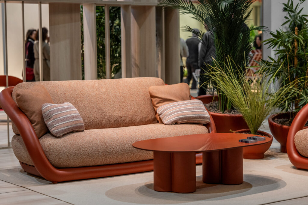
Maison&Objet | January 15-19 | Paris, FR
With 2,300 brands across seven halls, the global trade fair Maison&Objet unveils a curated world of home décor, furniture, craftsmanship, and lifestyle trends. The 2026 theme, “Past Reveals Future,” explores how materials and memory shape the next wave of design.
IMM Cologne | January 20-23 | Cologne, DE
IMM Cologne is a leading B2B trade fair bringing together the global interior design and furniture community. Under the theme “World of Interiors,” the event will showcase the latest in home lifestyles, contemporary furnishings, lighting, textiles, and innovative interior solutions from top international exhibitors.
IDS Toronto | January 22-25 | Toronto, ON
IDS Toronto is a vibrant celebration of global and Canadian creativity. From emerging talent to established brands, IDS offers an immersive experience featuring innovative exhibits, accredited seminars, keynote speakers, and the country’s largest design party.
DesignTO | January 23-February 1 | Toronto, ON
Canada’s largest annual design festival, DesignTO transforms Toronto into a vibrant city-wide showcase of creativity. Spanning 10 days with over 100 events, the festival presents a rich mix of exhibitions, installations, open studios, workshops, and design parties.
Las Vegas Market Winter | January 25-29 | Las Vegas, NV
Discover the latest in furniture, home décor, and gifts at Las Vegas Market. With 3,500+ brands across four expansive buildings, the market will offer interior designers exclusive access to trendsetting lines, immersive showrooms, and hands-on product exploration.
The International Surface Event | January 26-29 | Las Vegas, NV
With over 650 exhibitors, cutting-edge product demos, and 80+ education sessions, TISE delivers the future of flooring, stone, and tile. Explore the TILE + STONE and SURFACES neighborhoods, connect with industry leaders, and gain the insights and materials that keep your work at the forefront of design innovation.
Advancing Computational and Design Automation | January 26-28 | Austin, TX
This three-day conference is the definitive gathering for innovators at the forefront of computational design and automation in AEC. Featuring over 60 industry leaders from top firms like Gensler, Perkins&Will, Dialog, and Clayco, the program delivers high-impact sessions on AI-powered design tools, automation strategies, and advanced workflows.
International Conference on Interior Design and Interior Decoration | January 26-27 | New York, NY (Digital & In-Person)
Join global scholars and design professionals at ICIDID for an interdisciplinary exchange on innovation in interior design and decoration. This peer-reviewed conference provides a platform for presenting original research, discussing contemporary design challenges, and exploring new methodologies in spatial planning, user experience, and materials.
ALIS Design+ | January 28-29 | Los Angeles, CA
Dive into the future of hospitality design at this two-day conference and trade fair uniting hotel owners, developers, architects, and interior designers. ALIS DESIGN+ is where design vision meets investment strategy, spotlighting innovations in hotel architecture, construction, and sustainable design.
February 2026
NY NOW Winter Market | February 1-3 | New York, NY
Discover the season’s standout trends at NY NOW Winter Market. With emerging makers, established brands, and curated collections under one roof, this vibrant marketplace offers interior designers a unique opportunity to source fresh materials, explore innovative designs, and connect with makers and suppliers from across the globe.
Surface Design Show | February 3-5 | London, UK
Explore the forefront of surface material innovation at Surface Design Show. Bringing together over 180+ exhibitors and 6,000+ industry professionals, the show is a hub for discovering cutting-edge materials for both interior and exterior architecture. Highlights include the RIBA Conference, the Surface Spotlight Live feature, Material Evolution theme showcases, and inspiring installations like Stone Tapestry.
Zsonamaco | February 4-8 | Mexico City, MX
Zsonamaco, Latin America’s leading art and design fair, will host over 80,000 visitors at a five-day event bringing together four fairs — covering contemporary and modern art, design, antiques, and photography — under one roof. Attendees can explore a curated selection of furniture, textiles, design objects, fine art, and installations, alongside a robust program of talks, awards, and cultural activations.
AIA Leadership Summit | February 11-14 | Washington, D.C.
Join nearly 700 AIA leaders for four impactful days of advocacy and leadership development. The AIA Leadership Summit offers vital opportunities to influence policy on Capitol Hill, strengthen chapter leadership skills, and engage with AIA’s strategic vision. With curated CE tracks, high-level networking, and keynote insights from futurist April Rinne, this summit empowers design professionals to lead with purpose and drive meaningful change in the built environment.
Kitchen & Bath Industry Show | February 17-19 | Orlando, FL
Step into nearly 500,000 sq. ft. of innovation at this North American kitchen and bath design event. With 650+ exhibitors, dynamic panels, the NEXTStage, Voices from the Industry Conference, and the Luxury Lounge, KBIS offers unmatched access to cutting-edge products, expert insights, and industry networking in the kitchen and bath space.
Modernism Week | February 12-22 | Palm Springs, CA
Celebrate the best of midcentury modern design across 11 vibrant days in Palm Springs. With over 400 events, from architectural tours and immersive experiences to lectures, exhibitions, and vintage showcases, Modernism Week is a must for interior designers, architects, and design lovers alike.
Workspace Design Show | February 25-26 | London, UK
Workspace Design Show, featuring 5,000+ professionals in attendance, promises to be a hub of innovation for the future of workplace interiors. Featuring over 500 products and more than 130 expert speakers, the show spotlights the latest in acoustic solutions, furniture, surfaces, lighting, technology, and accessories. Conferences will explore critical themes such as sustainability, workplace trends, and employee-centric design strategies.
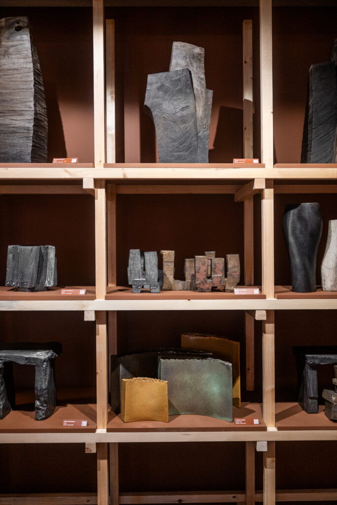
Collect | February 26-March 1 | London, UK
Collect is a leading international fair dedicated to contemporary craft and design. Spanning four days, the event brings together around 40 galleries from around the world, showcasing exceptional works in ceramics, glass, textiles, wood, metal, sculpture, and furniture. Collect offers a rare opportunity to discover and acquire museum-quality pieces that redefine material innovation and craftsmanship.
March 2026
Munich Design Days | March 12-15 | Munich, DE
Munich Design Days transforms Munich into a showcase of German design excellence. Taking place across more than 15 showrooms, the four-day festival is free to attend and tailored to interior architects, designers, decorators, hoteliers, and contractors. The event also coincides with Munich Stoff Frühling, a textile-focused showroom series, adding depth to this multifaceted design celebration.
SXSW – Design Track | March 16-18 | Austin, TX
Explore how design shapes both digital and physical spaces at SXSW’s Design Track. From UX and UI to architecture and spatial strategy, this track dives into the creative minds redefining how we experience the world. Sessions will highlight the convergence of aesthetics, functionality, and user-centered thinking. Access to this track is available with Platinum and Innovation Badges.
New York Build Expo | March 18-19 | New York, NY
New York Build Expo is the Northeast’s leading trade show for the design and construction industries, bringing together over 550 exhibitors and the same number of speakers for an expansive program of content and networking.
ATN Summit | March 18-19 | London, UK
The debut edition of the ATN Summit brings together architects, designers, technologists, and entrepreneurs for a future-focused two-day event. Through TED-style talks, workshops, and networking opportunities, the summit explores five key themes: Architecture & Design, Technology & Innovation, Business & Entrepreneurship, Influence & Media, and Construction & Making. Online workshops will also be hosted in the lead-up to the in-person conference, offering even more ways to connect and learn.
International Mass Timber Conference | March 31-April 2 | Portland, OR
The International Mass Timber Conference brings together global leaders in architecture, engineering, manufacturing, and construction. With over 100 expert speakers, the three-day event explores the latest in mass timber design and building technologies. Attendees can also join project tours, explore an expansive exhibition, and network with more than 3,000 professionals from 30+ countries.
April 2026
PAD Paris | April 8-12 | Paris, FR
PAD Paris is a design fair for collectors of historical and contemporary design. Showcasing top-tier French and international galleries, PAD curates a refined dialogue between past and present, offering a distinct perspective on the art of living and collecting.
Workplace & Design Conference and Expo | April 14 | Denver, CO
Explore the evolving intersection of workplace strategy, AI integration, and human-centered design at this half-day event, Workplace & Design Conference and Expo. Featuring expert-led panels, real-world case studies, and valuable CEU credits (3.5 IDCEC hours pending), this conference offers deep insights for interior designers shaping the future of office environments.
Living Luxe Design Show | April 16-19 | Toronto, ON
Canada’s luxury design event brings the pages of Living Luxe Magazine to life with a curated showcase of high-end design, home décor, and lifestyle inspiration. From elevated runway shows and celebrity speaker panels to exclusive evening events and a luxury-focused exhibitor directory, Living Luxe Design Show is a must for interior designers, developers, and tastemakers shaping refined spaces.
International Conference on Building, Architecture and Urbanism | April 20-21 | New York, NY (Digital & In-Person)
Connect with global scholars, researchers, and practitioners at ICBAU, an academic conference exploring the latest in building design, architecture, and urbanism. This interdisciplinary forum offers peer-reviewed research presentations, collaborative dialogue, and publication opportunities in top-indexed platforms.
Salone del Mobile | April 21-26 | Milan, IT
With thousands of exhibitors across seven dynamic days, Salone del Mobile.Milano sets the global benchmark for excellence in interior design, furnishings, and lifestyle. This year’s theme, “Past Reveals Future,” explores how material heritage shapes modern design.
High Point Market Spring | April 25-29 | High Point, NC
High Point Market offers thousands of brands, exclusive product launches, keynote speakers, and immersive showroom experiences. Whether you’re sourcing for clients or seeking inspiration, this is the must-attend event for interior designers who want to stay ahead of the curve and make meaningful industry connections.
May 2026
NYCxDESIGN | May 14-20 | New York, NY
Showcasing installations, talks, exhibitions, and public programming throughout New York, NYCxDESIGN highlights emerging voices, innovative ideas, and cultural collaborations that reflect the future of design. From interactive pavilions and original exhibitions to thought-leading keynotes and AI-focused conversations, NYCxDESIGN is for designers who want to be inspired by the energy of one of the world’s most dynamic design capitals.
International Contemporary Furniture Fair | May 17-19 | New York, NY
ICFF returns with an inspiring mix of global design talent, immersive experiences, and cutting-edge product launches. From the Bespoke Salon and Aqua Atelier by GROHE to curated lounges and the celebrated WANTED showcase, ICFF delivers three dynamic days of networking, education, and discovery.
Clerkenwell Design Week | May 19-21 | London, UK
Clerkenwell Design Week transforms London’s creative district into a hub of contemporary design innovation with 600+ showroom events, curated exhibitions, striking installations, topical talks, workshops, and fringe programming. CDW connects designers, architects, makers, and industry leaders in immersive experiences across furniture, lighting, textiles, surfaces, and more.
June 2026
International Conference on Sustainable Interior Design | June 1-2 | San Francisco, CA (Digital & In-Person)
ICSID brings together global scholars, researchers, and practitioners to advance knowledge and innovation in sustainable interior design. This interdisciplinary forum offers peer-reviewed presentations on eco-conscious materials, healthy indoor environments, and green building strategies.
NeoCon | June 8-10 | Chicago, IL
For over 50 years, NeoCon has been the destination for commercial interior design, where 400+ top brands debut the latest in workplace, healthcare, hospitality, and education environments. NeoCon features an all-new Preview Day, world-class programming, and unmatched networking across the global design community.
AIA Business Academy | June 9 – October 27 | Blended Format
Unlock your firm’s growth potential with AIA’s intensive four-part Business Academy. Designed for architecture firm leaders, this strategic bootcamp blends in-person and virtual sessions led by top MBA faculty. Over five months, you’ll refine your value proposition, build high-performing teams, and develop a market-responsive strategic plan. Earn 22.75 LUs while gaining the leadership and financial skills needed to scale your practice for long-term success.
3daysofdesign | June 10-12 | Copenhagen, DK
As Denmark’s official design festival, 3daysofdesign transforms Copenhagen into a city-wide celebration of creativity, craftsmanship, and innovation. With engaging installations, talks, and curated exhibitions across the city, 3daysofdesign invites global visitors to experience Danish design at its finest.
AIA Conference on Architecture & Design | June 10-13 | San Diego, CA
Join thousands of AEC professionals at AIA26. This four-day conference features high-impact keynotes, architect-led tours, top-tier continuing education (including HSW credits), and the industry’s largest expo with 600+ brands.
UIA World Congress of Architects | June 28-July 2 | Barcelona, ES
Themed “Becoming. Architectures for a Planet in Transition,” the 29th UIA World Congress gathers over 10,000 global professionals in Barcelona to explore architecture’s role in a rapidly changing world. Expect talks, round tables, exhibitions, and workshops across the city.
July 2026
New Designers | July 1-4 | London, UK
New Designers brings together over 2,000 emerging talents from 200+ UK universities. Explore fresh ideas in fashion, textiles, furniture, ceramics, and more at this essential showcase of the next generation of design.
September 2026
Habitare | September 2-6 | Helsinki, FI
Finland’s leading design fair returns with the theme “Plot Twists,” celebrating experimental, unexpected approaches to materials and form. Habitare showcases Nordic design across furniture, lighting, and accessories, alongside talks by designers, architects, and cultural voices.
Maison&Objet | September 10-14 | Paris, FR
Running alongside Paris Design Week, Maison&Objet returns for its autumn edition, spotlighting decor, design, fashion, fine craft, and more. This influential trade show brings together global professionals to discover the latest in lifestyle and interior trends.
London Design Festival | September 12-20 | London, UK
London Design Festival returns with nine days of exhibitions, installations, talks, and launches across the city. Explore cutting-edge design in fashion, interiors, architecture, and more through events in key districts like Shoreditch, Mayfair, and Chelsea.
Focus/26 on Design | September 14-18 | London, UK
Focus/26 on Design offers an exclusive first look at new collections from top design houses, many of which don’t exhibit anywhere else in the UK. With 30+ pop-up brands in the Design Avenue and expert-led sessions focused on professional growth, it’s a must-attend for the showroom talks, designer meet-and-greets, masterclasses, and more.
GATHER: Catalyst | September 16-18 | Dallas, TX
Join the interior design community for ASID’s national leadership conference, GATHER: Catalyst, coinciding with ARCHLight and Dallas Design Week. With educational sessions, exhibitor interactions, and community celebrations, Catalyst is your opportunity to connect, grow, and help shape the future of interior design.
IDS Vancouver | September 24-27 | Vancouver
IDS Vancouver brings visionary brands, emerging makers, and influential designers together under one roof. Explore the latest furniture, lighting, materials, and interiors trends, engage with compelling programming, and build meaningful connections across the Pacific Northwest design community.
IDS Conference | September 28-30 | Las Vegas, NV
Set against the backdrop of world-class interiors and entertainment, IDS Conference unites award-winning designers, IDS chapter leaders, and top industry voices. Expect immersive sessions, inspiring keynotes, and invaluable networking.
October 2026
Decorex International | October 11-14 | London, UK
Decorex brings together top designers, architects, makers, and brands to showcase exceptional furniture, lighting, textiles, decorative accessories, and more. With seminars, workshops, and opportunities to connect with leading creatives, this one is perfect for seeking fresh ideas, craftsmanship, and the latest trend direction in high-end interiors.
PAD London | October 13-18 | London, UK
Celebrated for its curatorial sophistication and collector-driven ethos, PAD London brings together the world’s leading galleries showcasing 20th-century design, contemporary works, decorative arts, and objets d’art.
High Point Market Fall | October 17-21 | High Point, NC
With thousands of brands, exclusive product launches, keynote speakers, and immersive showroom experiences, High Point Market is where design trends are born. Whether you’re sourcing for clients or seeking inspiration, this is the must-attend event for interior designers who want to stay ahead of the curve and make meaningful industry connections.
Design Miami.Paris | October 20-25 | Paris, FR
Design Miami.Paris brings the global design conversation to the heart of Europe’s design capital. This esteemed fair presents a curated showcase of 20th and 21st-century furniture, lighting, and collectible works from leading galleries.
November 2026
Boutique Design New York | November 8-9 | New York, NY
Set in the heart of NYC, BDNY is the ultimate trade fair for boutique hospitality design. This curated event connects forward-thinking designers, hoteliers, and brands with premium vendors and never-before-seen products. From immersive experiences and design-forward pop-ups to 40+ conference sessions and global networking, BDNY is where collaboration drives the future of hospitality interiors.
WestEdge Design Fair | November 20-22 | Santa Monica, CA
Explore cutting-edge home furnishings from top and emerging brands, enjoy thought-provoking panel talks, culinary demos, and hands-on workshops, and connect with industry visionaries in a trend-forward setting at WestEdge. From the Opening Night Party to the IIDA Awards and Connoisseurs’ Club programs, WestEdge offers a curated experience where design comes alive.
December 2026
Design Miami | December 1-6 | Miami Beach, FL
As the flagship fair of the Design Miami family, Design Miami returns to its Miami Beach home for a world-class celebration of collectible design during Miami Art Week. This event showcases museum-quality furniture, lighting, and objets d’art from top international galleries alongside curated talks, incredible installations, and cultural programming that define today’s design frontier.