In interior design, color is more than just a visual element; it’s a powerful designer’s tool that can evoke emotion, create ambiance, and define the overall aesthetic of a space. Understanding color theory is paramount for any designer seeking to craft truly exceptional interiors. One of the most fundamental tools in this arsenal is the color wheel. Let’s go back to basics for some fresh inspiration.
A Brief History of the Color Wheel
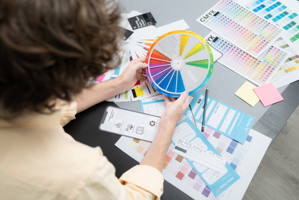
The color wheel, first introduced by Sir Isaac Newton in his 1704 book Opticks, is a visual representation of the color spectrum. It organizes colors in a circular pattern, showcasing their relationships and interactions. This simple yet invaluable tool has become a cornerstone of color theory and design.
Your Essential Design Tool
The color wheel is typically divided into three primary colors: red, yellow, and blue. These colors cannot be created by mixing other colors. Secondary colors, such as green, orange, and purple, are formed by combining two primary colors. Tertiary colors, like red-orange and blue-green, result from mixing a primary color with a secondary color.
Beyond the basic colors, the color wheel also illustrates various color properties:
- Hue: The pure color, such as red or blue.
- Saturation: The intensity or brightness of a color.
- Tint: A color created by adding white to a hue.
- Shade: A color created by adding black to a hue.
- Tone: A color created by adding gray to a hue.
Color Harmony: The Art of Combining Colors
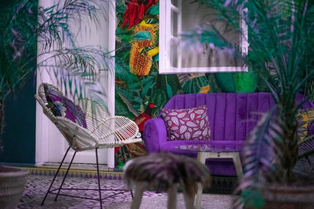
The color wheel is not just about individual colors; it’s also about how colors work together. Color harmony refers to the pleasing arrangement of colors in a design. There are several common color harmonies:
- Complementary: Colors opposite each other on the color wheel, such as red and green.
- Analogous: Colors adjacent to each other on the color wheel, like blue, blue-green, and green.
- Monochromatic: Variations of a single color, such as different shades of blue.
- Triadic: Colors forming an equilateral triangle on the color wheel.
- Tetradic: Two pairs of complementary colors.
The Psychology of Color
Colors evoke specific emotions and can significantly impact the atmosphere of a space. For example, warm colors like red, orange, and yellow are often associated with energy, excitement, and passion. Cool colors like blue, green, and purple are typically perceived as calming, serene, and trustworthy.
Color in Interior Design
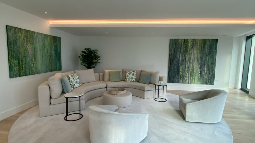
Interior designers can leverage color theory to achieve various design goals:
- Create a desired mood: Use warm colors for a vibrant, energetic space, and cool colors for a relaxing, tranquil ambiance.
- Highlight architectural features: Employ color to draw attention to specific elements of a room.
- Define a style: Certain color palettes are associated with particular design styles, such as bold, contrasting colors for modern interiors or soft, muted tones for traditional spaces.
- Enhance natural light: Consider the amount of natural light in a room when selecting colors. Dark colors can absorb light, while lighter colors can reflect it.
Tips for Using Color Effectively
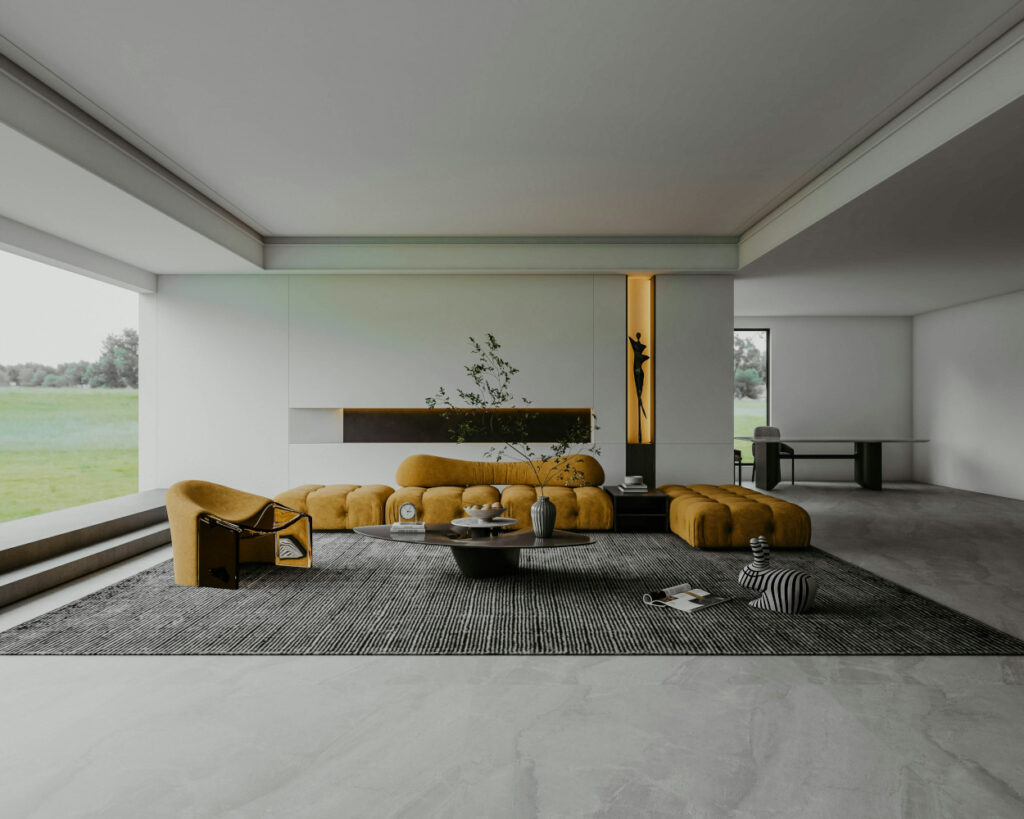
- Start with a neutral base: A neutral color palette can provide a foundation for bolder color accents.
- Use the 60-30-10 rule: Choose a dominant color, a secondary color, and an accent color to create a balanced composition.
- Consider the scale of the room: Large spaces can handle bolder color combinations, while smaller rooms may benefit from more subtle palettes.
- Test colors before committing: Use paint samples or fabric swatches to visualize how colors will look in your space.
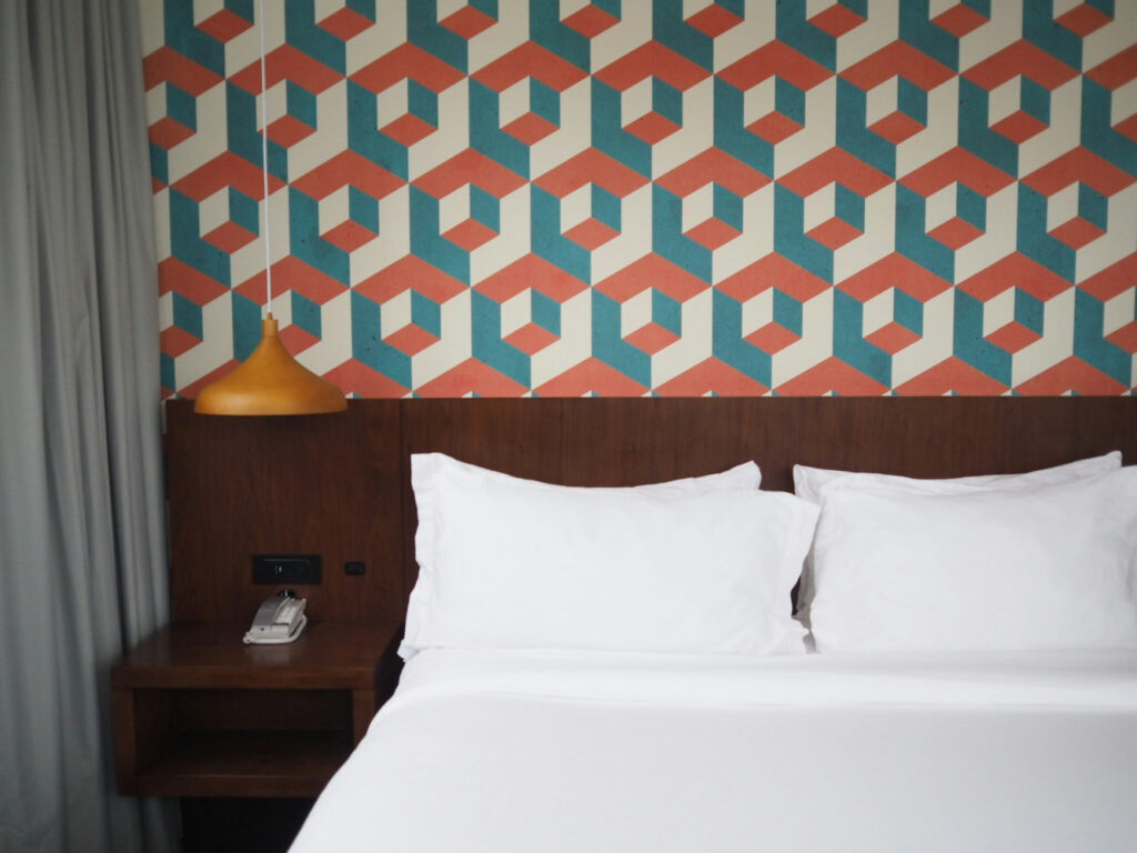
Dynamic Color Combinations Inspired by Experts
For a fresh perspective on color combinations, consider these expert-recommended combos:
- Terra-cotta and ice blue: A cool and clean vibe.
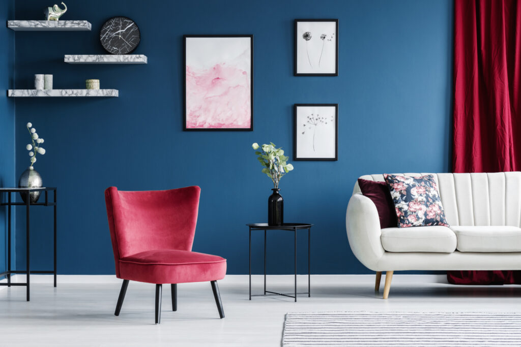
- Red and blue: A classic and versatile pairing.
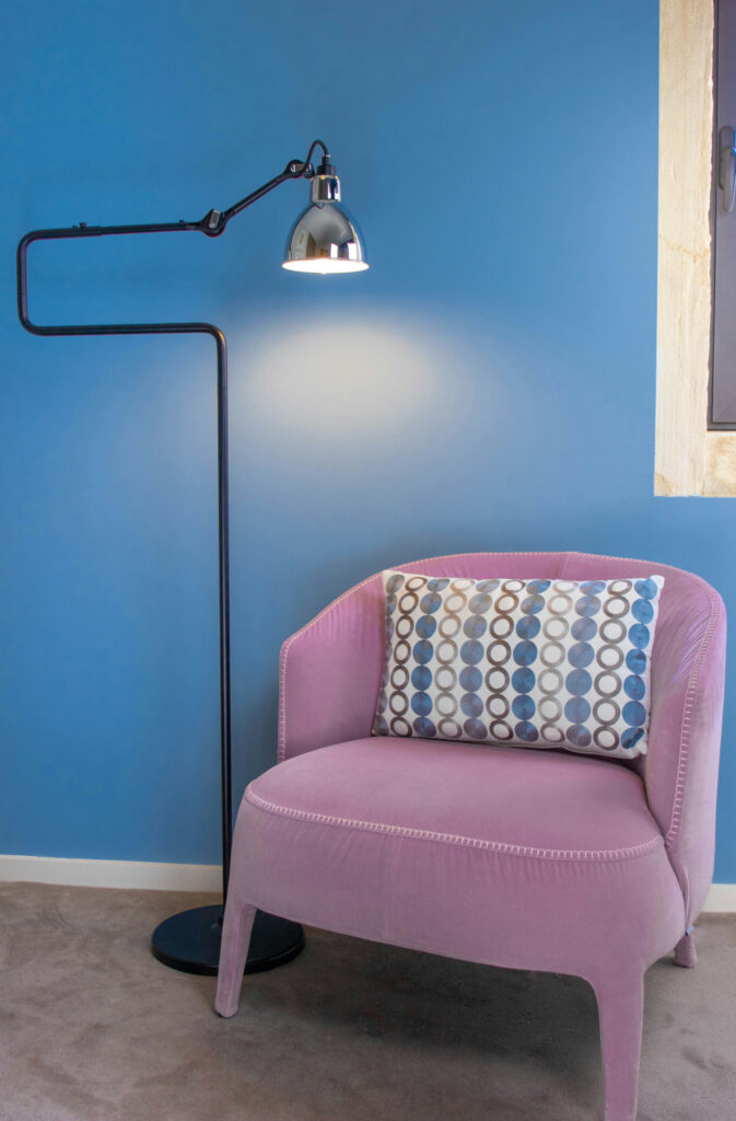
- Lavender and camel: A magical and warm combination.
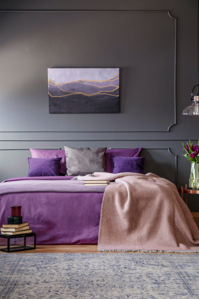
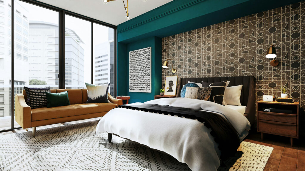
- Middle green and cool violet: A dramatic and jewel-toned duo.
- Dirty blush and golden yellow: A subtle yet impactful palette.
- Yellow, blue, and brown: A harmonious and unexpected trio.
- Carrot orange and cornflower blue: A vibrant and complementary pair.
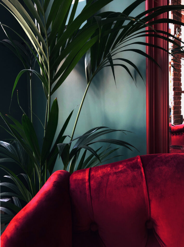
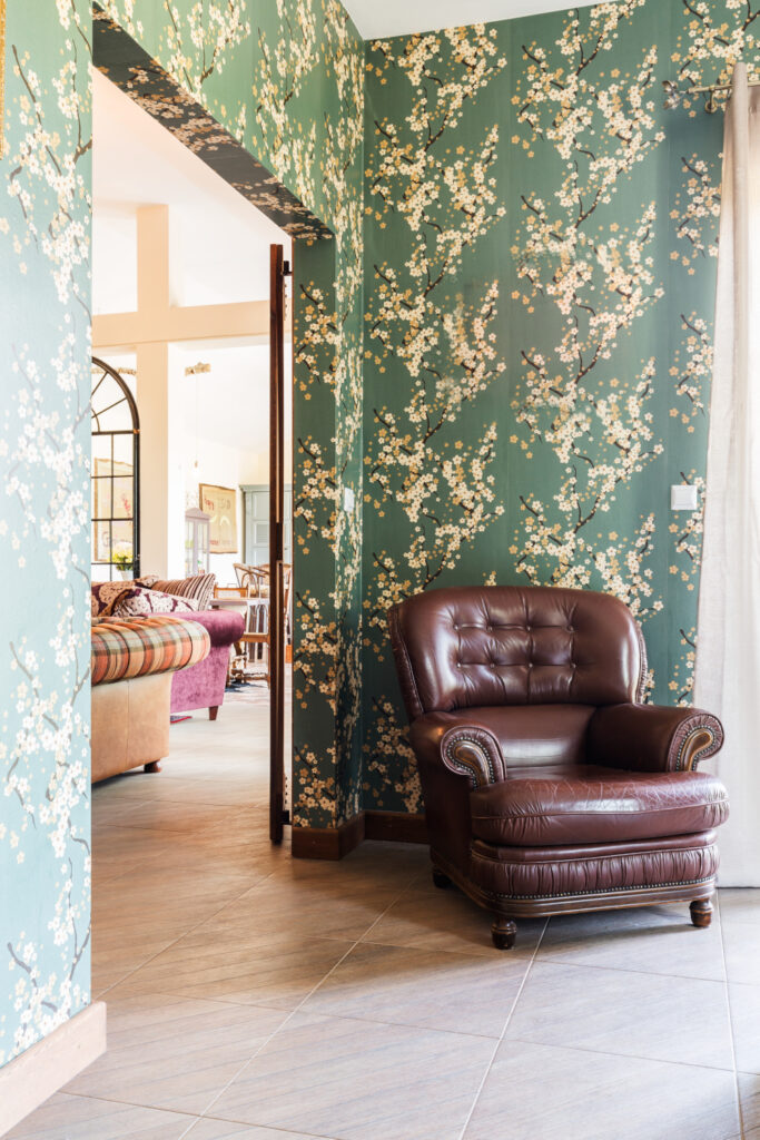
- Red and green: A bold and festive choice.
- Emerald green and turquoise blue: A saturated and sophisticated combination.
Color is more than just a visual element; it’s a language that speaks directly to our emotions. By mastering this language, designers can create spaces that not only inspire but also transform. The power of color is truly limitless.
