

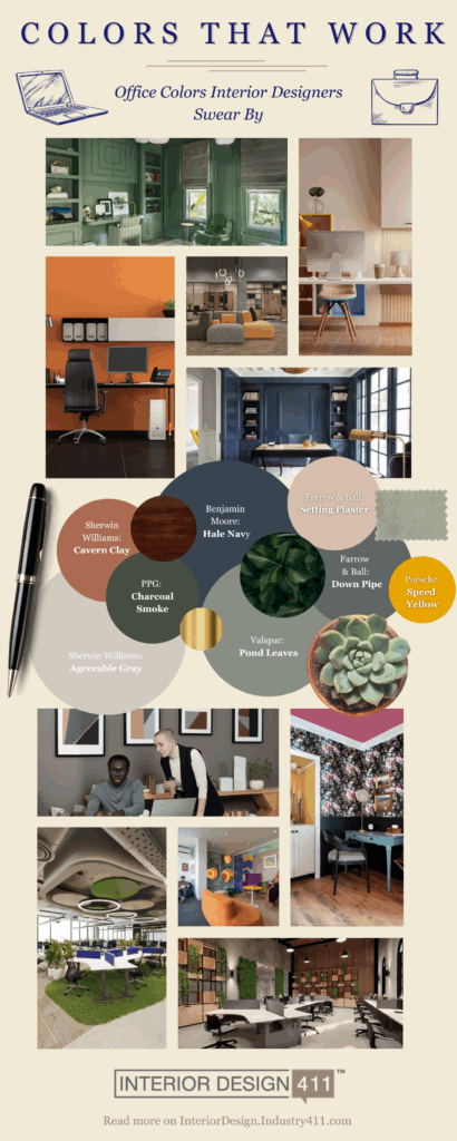
Choosing the right paint for office spaces — whether residential or commercial — is a strategic design decision that can impact daily focus, mood, and productivity. While clients may gravitate toward personal preference, interior designers know the best choices that balance individual style with environmental psychology. Here’s what’s resonating with your peers and why these shades deserve a spot on your project list.
Top Contenders That Deliver: Greige and Dark Blue
Two colors stood out in designer circles: warm greige and dark blue. Both offer vastly different moods yet rank equally high in functionality.
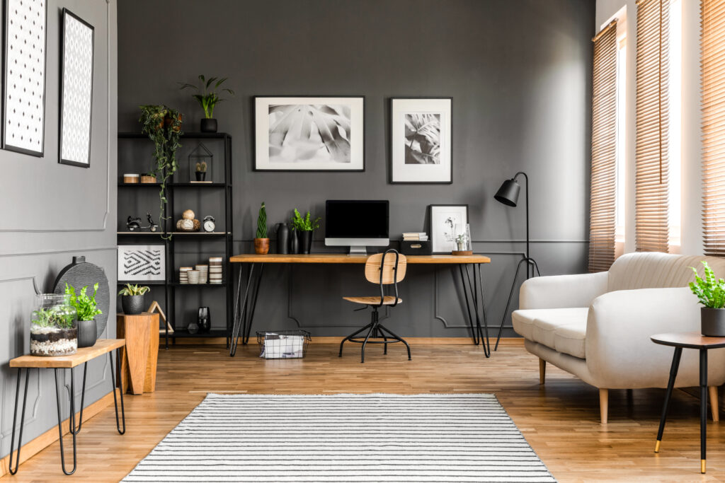
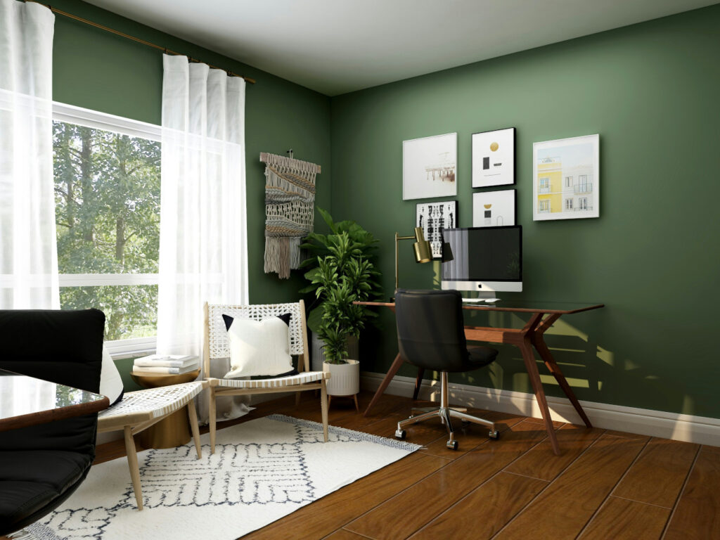
Greige continues to earn praise for its understated versatility. Designers recommend it as a foundational neutral that adapts well to evolving furniture and decor, while subtly encouraging calm and focus. Sherwin-Williams’ Agreeable Gray (SW 7029) is a perennial favorite, offering just enough warmth to avoid sterility without veering too beige. In client-facing environments or high-use home offices, greige delivers a low-risk, high-reward backdrop.

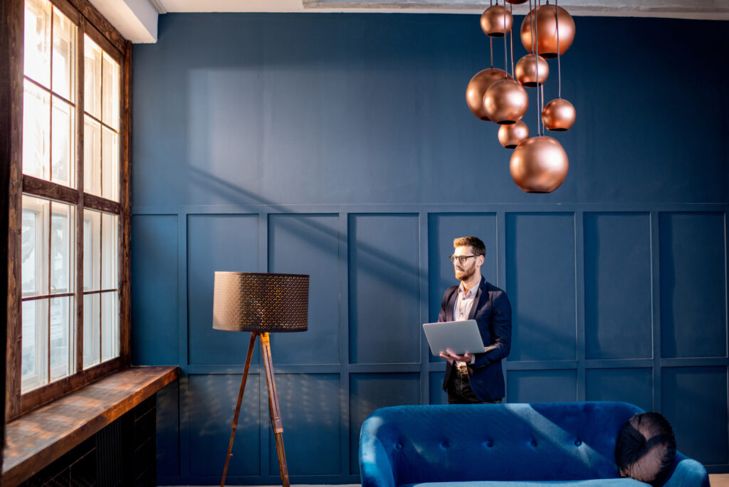
Dark blue, exemplified by Benjamin Moore’s Hale Navy (HC-154), serves a different purpose. It supports “color drenching,” a technique where walls, trim, and ceilings are all painted the same hue to create an elegant, cocooning effect. This approach serves more than an aesthetic purpose, though; it can help establish clear spatial boundaries between work and home, which is essential in hybrid work environments. Used in corporate break-out rooms or private offices, it also adds a calming gravitas without being overpowering.

Don’t Like Greige or Dark Blue? Here Are Some Alternatives
While greige and navy dominate, other shades are gaining ground across varied office contexts:
Warm Whites
Benjamin Moore’s Simply White and Feather Down offer clean slates ideal for layered styling. These are particularly effective in offices with abundant personal artifacts or branding elements. They make a space feel open and bright, helping small offices appear larger.
Deep Greens
Shades like Ripe Olive (SW 6209) or Jasper (SW 6216) resonate with designers seeking grounded yet dramatic aesthetics. These work especially well in boutique firms or creative agencies that want a slightly unconventional but still sophisticated atmosphere.
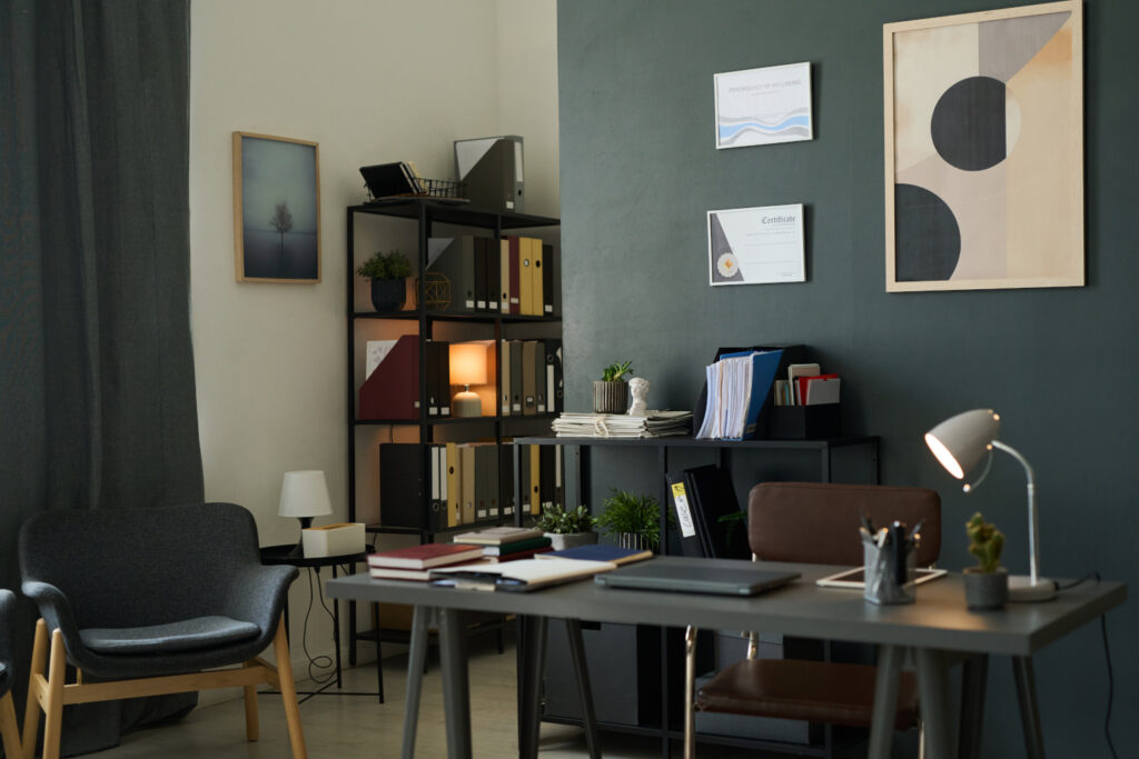
Charcoal Grays
Think Farrow & Ball’s Down Pipe. These are sleek, moody, and professional. They offer a modern alternative to navy for clients wanting drama without vivid color. Charcoal tones pair well with a broad spectrum of accent colors, making them a safe but impactful choice.
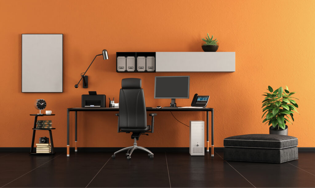
Warm Accents
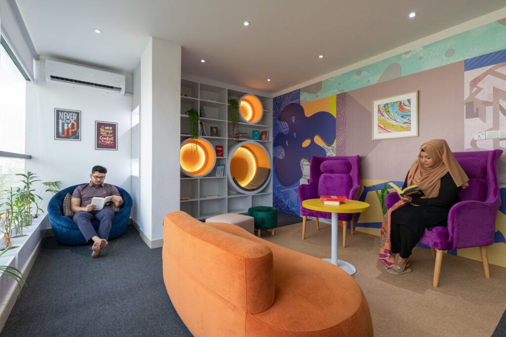
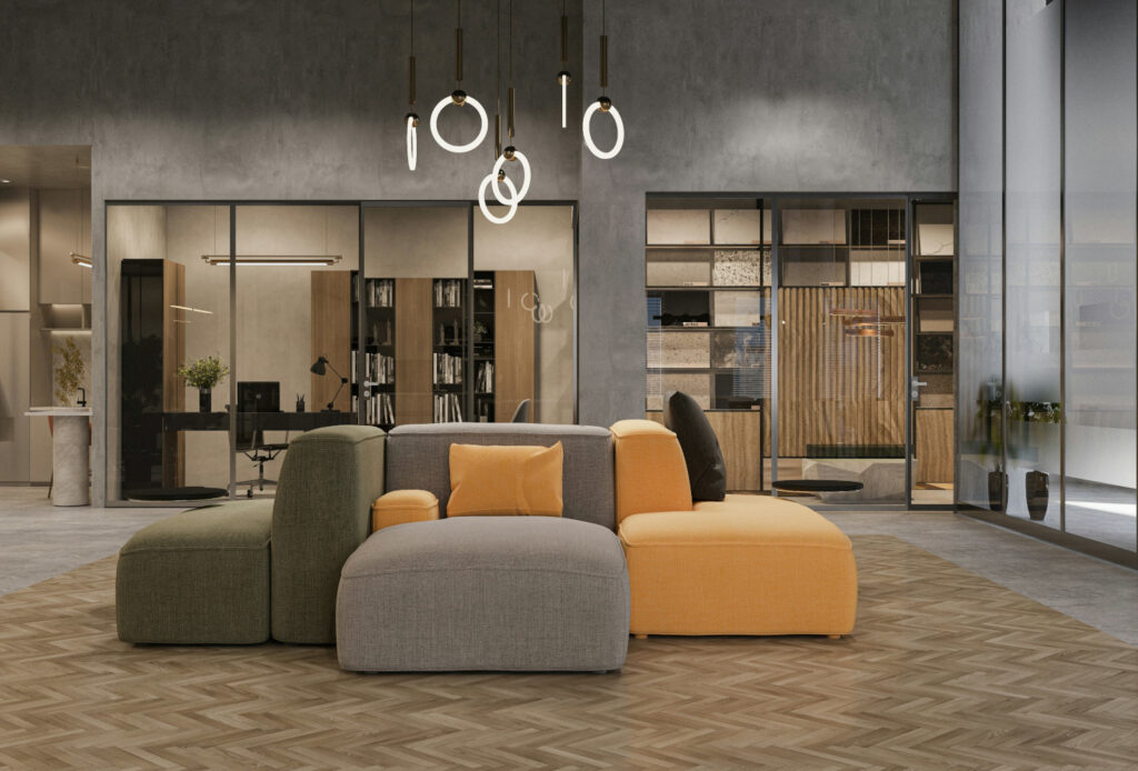
For studios, design labs, or creative consultancy offices, bold hues like Porsche Speed Yellow or Cavern Clay (SW 7701) can energize the space and spark creative thinking. Use them selectively! Feature walls or alcoves are your friend with these hues.
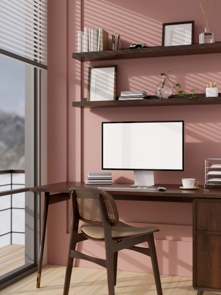
Sophisticated Pinks
Farrow & Ball’s Setting Plaster offers a mature, muted pink that brings warmth and softness without feeling juvenile. This works well in wellness, fashion, or lifestyle-focused businesses looking to infuse subtle personality into the workspace.
Palettes That Enhance Productivity
Even the best color can fall flat without a thoughtful palette. Here are two effective ways to build around our top contenders:
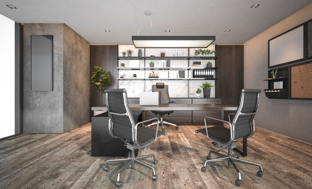
Dark Blue + Warm Woods + Metallics
This trio exudes sophistication. Brass, bronze, or matte black accents lend polish, while medium to dark woods ground the space. Great for executive offices or reception areas where first impressions matter.
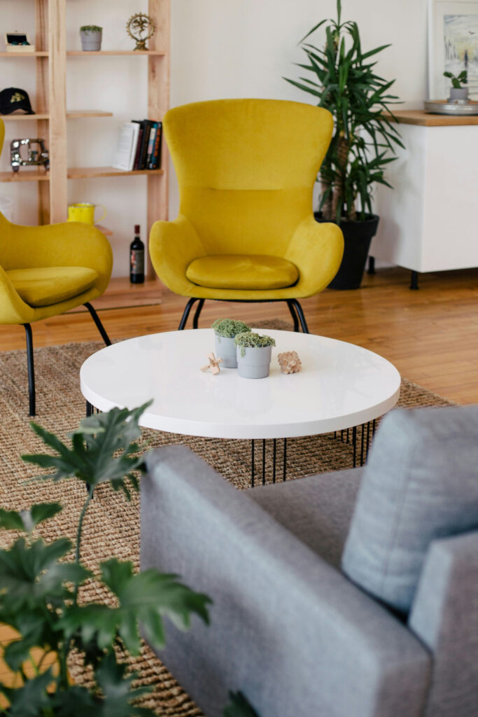
Greige + Natural Tones + Soft Whites
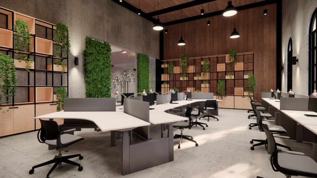
Think biophilic design. The warmth of greige allows for a steely, professional feel that still pairs perfectly with trendy biophilic elements. Layer greige with light woods, greenery, and creamy whites. Add matte black hardware or leather for texture. This is particularly effective in open-plan coworking environments or client consultation spaces.
Clients want their spaces to feel intentional. They’re looking for environments that are emotionally attuned to the task at hand, whether that’s coding, collaborating, or closing deals.
When recommending paint colors, always consider the space’s primary function, lighting conditions, and the client’s brand identity or personal style. Offer palette suggestions that scale well and maintain cohesion. In a market flooded with fads, sticking to well-tested palettes backed by your peers gives your projects longevity and adaptability to stand out among modern workspaces.