

Sherwin-Williams just released its 2026 Colormix Trend Forecast Anthology Volume Two, an update on their 2024 release that analyzes trending colors and their evolving emotional and cultural associations. The Trendsight Team, guided by Sue Wadden and Emily Kantz, spent years tracking color movements to deliver 48 nuanced hues organized into four expressive palettes. These collections embody subtle shifts in perception: pastels with purpose, shades that embody warmth, deep tones with emotional resonance, and neutrals with personality. These are the paint picks gaining momentum for 2026, poised to influence both client requests and supplier offerings across the design spectrum. This week, Interior Design 411 is getting you future-ready by exploring how to apply these freshly curated palettes with insight.
Frosted Tints
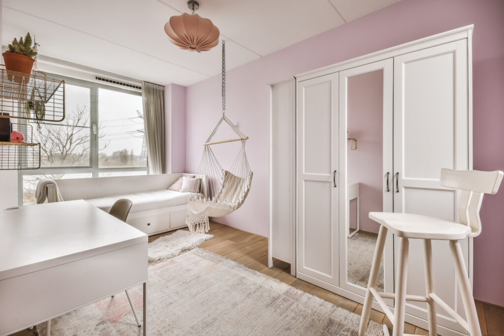
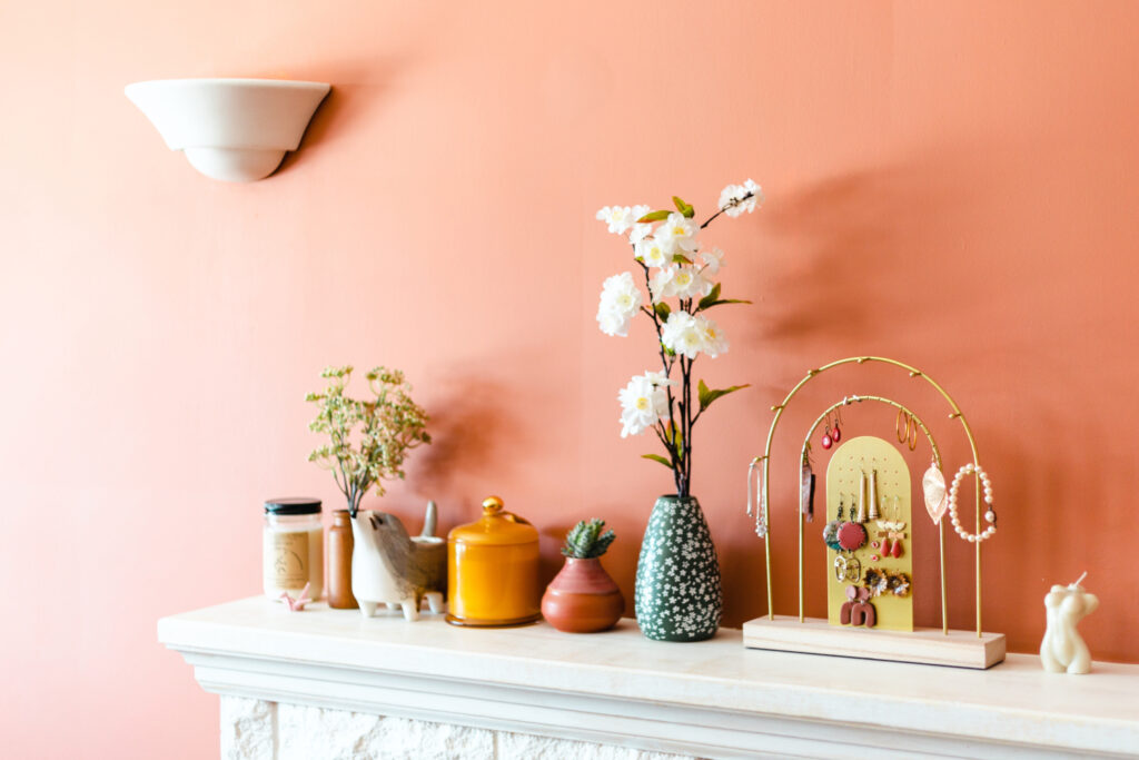
The pastel collection includes near-weightless lavender, green and blue tones embodying the softer side of biophilia: Modern Lavender, Celery, Grape Mist, Tradewind, Halcyon Green and more. But these aren’t your typical Easter pastels. Grape Mist carries a whisper of mauve-gray, like fog rolling across a spring garden, while Celery feels like a dewy sprig of new growth — fresh without being sweet. They offer a refined, minimal, and elegant injection of color to an otherwise pared back interior. Use them to break up neutral-heavy kitchens or powder rooms. A Halcyon Green cabinet can add a lift of life to a cool kitchen without disrupting a chromatic neutral palette.
Pro tip: In minimalist spaces, these tones act as calm focal points, serving soft but distinct. Best applied to cabinetry, trim or a single accent wall.
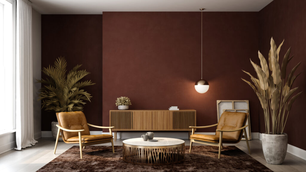
Sunbaked Hues
Inspired by midcentury design and hazy desert landscapes, this palette includes Sundew, Coral Island, Armagnac, Lemon Chiffon, Heartthrob, Henna Shade, Pennywise and others. These shades shift subtly with daylight, coaxing in the heat of the sun and evoking tactile warmth to even the darkest, coolest corners of a space. Sundew, a soft golden yellow, feels like morning light filtering through linen curtains, while Armagnac delivers a burnished, clay-like orange with the richness of sunbaked adobe. Together, this duo can lend rooms a lived-in vibrancy that reads rich and organic.
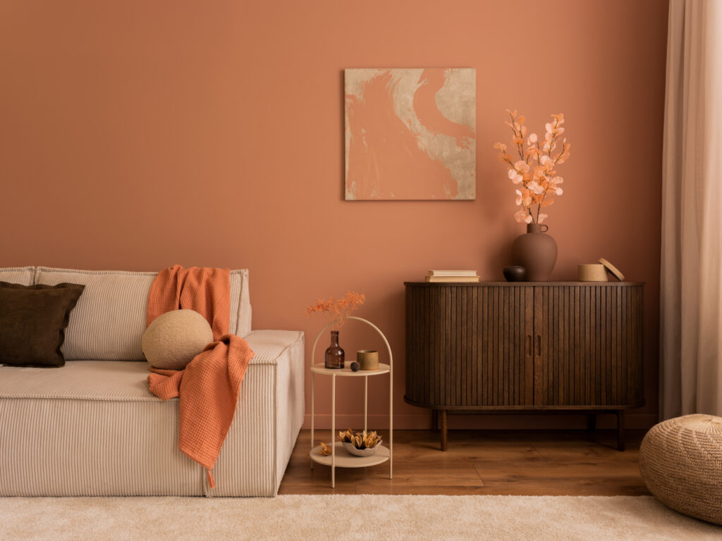
Use case: Living rooms, patios, or guest bedrooms where warmth is key. Layer sunset reds and golden yellows to energize spaces without overpowering.
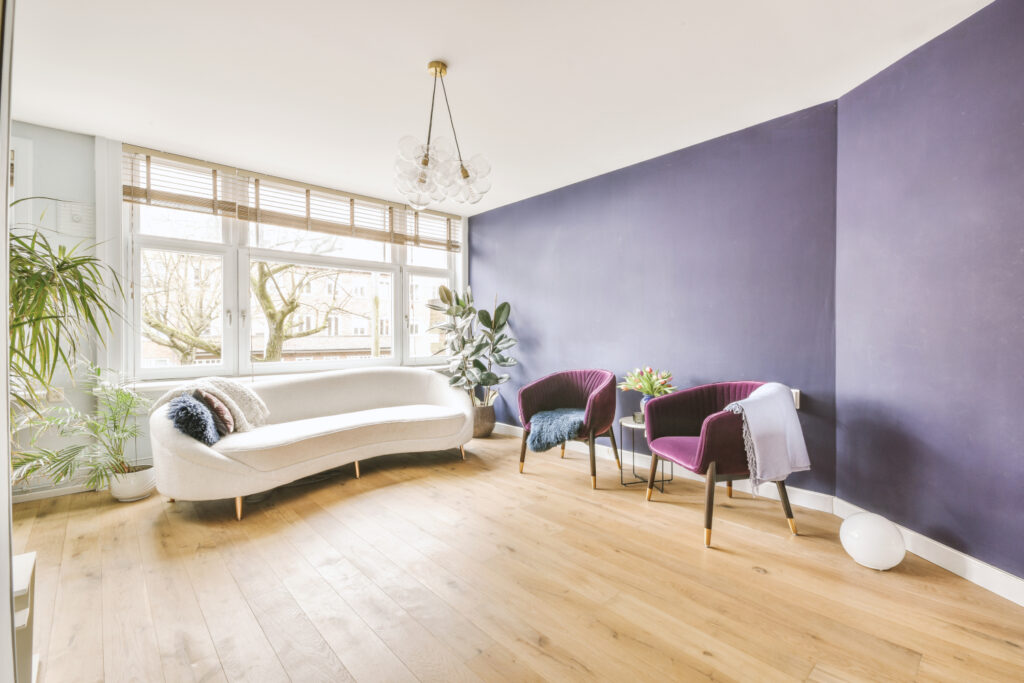
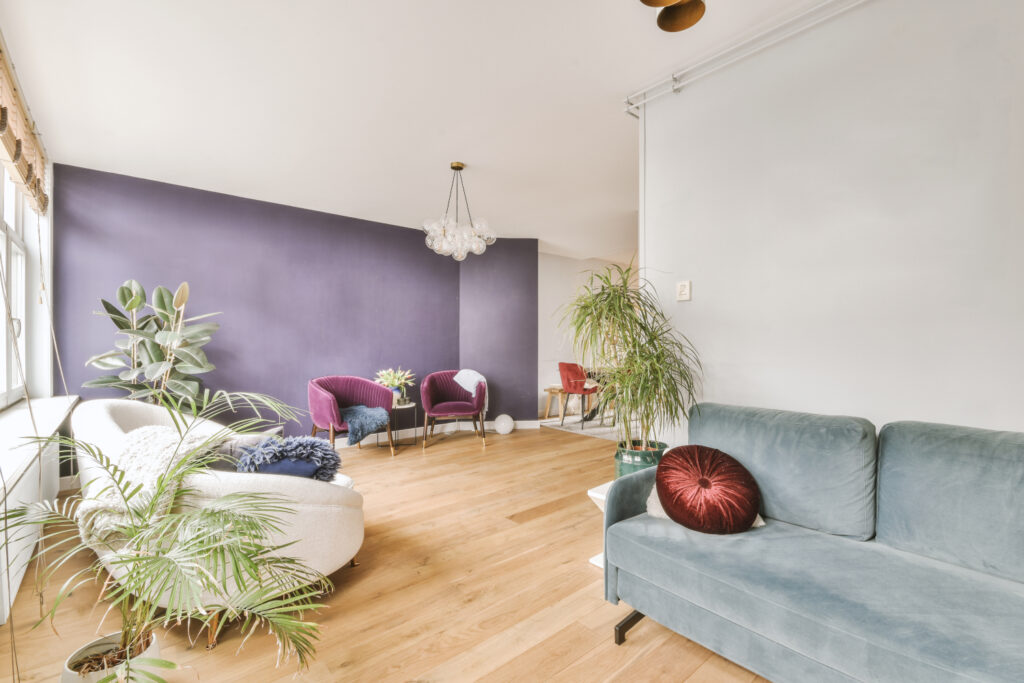
Restorative Darks
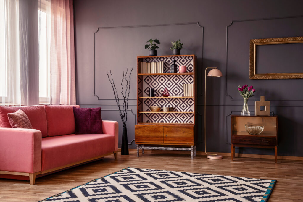
This collection revisits rich tones like Carnelian (reimagined into Dark Auburn and Plum Brown), Relic Bronze, Tarragon, Rojo Marrón, Sable and more. Plum Brown smolders with a moody mix of violet and umber, while Relic Bronze leans into a patinated, metallic earthiness that catches just enough light to feel alive. These deep, resonant colors provide cozy enclosure, a useful tool in spaces meant to feel intimate and enveloping.
Best in: Bedrooms or dining rooms where texture, layered wood or metal accents soften heaviness and invite lingering. Pair dark walls with natural textiles and reflective metals to bring in light.
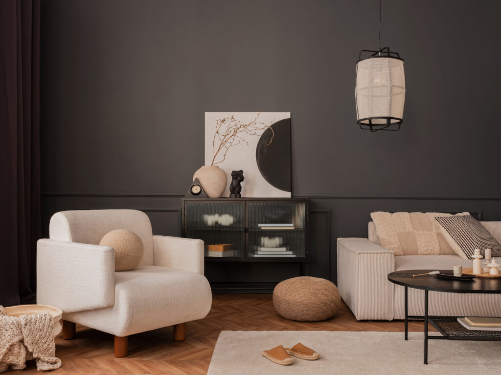
The New Neutrals
White Snow, Sanderling, Universal Khaki, Pavestone, Clove, Inkwell, Mushroom and others form a neutral palette with character, from warm taupe to deep blue-black. Inkwell delivers a dense, inky navy that reads black in shadow, while Clove’s brown-black base is laced with a hint of bronze, adding subtle warmth to traditionally stark tones. These aren’t the builder-grade neutrals you’re used to. They offer a layered, elegant and purposeful feel that supports both restraint and richness.
Application idea: Use these as baselines for a layered design. Think tone-on-tone trim, furniture, and flooring. They support bolder accents or crisp styling without flattening the palette.
From the Forecast to Your Future Projects
Frosted Tints invite minimal elegance. Sunbaked Hues bring earthy energy. Restorative Darks offer enveloping calm. Foundational Neutrals provide the backbone for layered sophistication. This novel presentation of trends, from broad groupings to emotional tone and color-family evolution, gives you a palette toolkit for telling design stories rooted in psychology, context, and cultural shifts.
Instead of chasing color trend cycles in 2026, you can now take inspiration from palettes designed to align with evolving client needs and emotional cues. Frame color as strategy in your next pitch. Understanding emotional tone mapped to hue can be your edge in crafting interiors that don’t just look current but feel purposeful, for the next year and beyond.
These color collections reflect deep industry expertise in tracking how cultural shifts influence color preferences across commercial and residential spaces. Use them not as prescriptions, but as curated starting points in your own work — a tool for shaping narratives, building emotional resonance, and designing environments that are as intentional as they are relevant.
SOURCES: Elle Décor, Sherwin-Williams, Builder Online

")